Blaise Drummond was one of my lectures in GMIT, and my artistic development was

Blaise Drummond
greatly broadened thanks to him and my other lecturers. My conversations with Blaise were and are hugely beneficial, and elements of those conversations can be found in Painting in Text. Blaise was one of the first names that came to mind when I started the blog, and I’m glad that I can share this interview with you
In your work you are known for paintings of buildings in nature, would you like to talk about that?
Well, I grew up in the suburbs of Liverpool, there has always been something I’ve liked about that combination of nature and the built environment. I think in art school (NCAD in the early 90’s) I tended towards making images of that sort , mostly using vernacular architecture. I particularly liked sheds and rural buildings. I remember at a certain point seeing an image of Le Corbusier’s Villa Savoye in a magazine and I thought that was kind of interesting and I made a little painting with that (combined with a sort of cack handed stencil taken from Bocklin’s Island of the Dead as I recall) . I think the modernist thing kind of branched out from there and I started to look at classic high modernism and obviously then when you’re looking at the books you start to read the text and think about them and the philosophy behind those buildings. The attempt to manipulate the environment in different kind of ways in various utopian and idealistic projects and all of that has sort of seeped into my work ever since.

Summer House, (2019), oil on collage, 127 x 167 cm
Essentially the impulse is probably a formal one to do with paint in a way. The material

The Apartment, (2019), oil, collage and beeswax on birch ply, 122 x 161cm
embodies some of those ideas about the wider world. There are contrasts and juxtapositions between flat deliberate hard edge paint, with more fluid deposits- I don’t want to use the word natural – but when paint does something slightly of its own volition, but it’s obviously quite controlled by the artist too, isn’t it? Because you decide how liquid the paint is, what colour it is and where on the canvas you drop it. But there is a certain amount of out of your controlness there. That contrast appeals to me, and the same sorts of tensions can be seen between the built and the ‘natural’ world.
I started making these paintings in 2003 – by these paintings, I mean what I think of as the white paintings, where they are quite big, and have a building in some sort of natural setting. A normal show would be those paintings with sculptural elements, or an installation usually occupying the three-dimensional space. All combining into a conversation. After ten years of that, I’d made nearly a hundred pieces in that vein, and began to feel like maybe some of the excitement had gone out of it?
There was excitement at the beginning because you didn’t know how it was going to turn out. And then there is a stage where you’re confident, yeah this is great I know how to do this. And they are coming out good (well some are, some of them bad maybe), but you know you understand what works and doesn’t. But then maybe you get into a later like older stage where it is too well-known territory, maybe comfortable and a bit predictable. So bit by bit over the last few years I’ve been sort of trying to find a little more elbow room in the work and a slightly different way of making things.
How are you pushing those boundaries?
For some reason lately I find myself often drawn back to the history of Black Mountain College. It was an experimental art school in North Carolina in the thirties and forties, it lasted into the fifties a bit. Over the years, I’ve made loads of paintings in relation to that. The first catalogue of my work was called By the Shores of Lake Eden. Lake Eden is on the campus of Black Mountain College. The college is famous for its alumni who went on to be pivotal in the development of modernism in America – Buckminster, Fuller, John Cage, Willem and Elaine de Kooning all taught there, Robert Rauschenberg was a student and most famously Josef and Anni Albers. I’ve been reading a lot of Josef Albers recently and some of that has seeped into the work I’m making. Little visual jokes I suppose about Alber’s colour exercises with his students. So, for example, in this painting Munkkiniemi

Munkkiniemi Field, (2018), oil on canvas, 167 x 147 cm
Field (Munnkiniemi is a suburb of Helsinki where the Alvar Aalto house is) The painting is based on photographs I took in the back garden of the house which looks out onto an Astro pitch. I was there on a beautifully sunny day in June a couple of years ago and I just thought the artificial colours of the Astro looked great. There’s a part of the painting describing the football goal nets which is a sort of a pun on an Albers colour exercise about transparency.
The ways in which we read painting, or any 2-dimensional surface that purports to describe a thing in the round, is interesting to me. While I was painting this, Soren, my 7 year old, was here while I was dropping splashes of paint on the canvas to describe the leaves on the tree and he said – why are you putting it there? What is that? And after a bit I realised what he was talking about – how could be a leaf there when there was no branch connecting it to the tree? They were just random splashes of paint to him within a painting that otherwise appeared to be descriptive. Cos when you’re a kid drawing a tree probably every leaf you draw is attached to the tree, which to be fair is logical. But I realised that there is kind of a sophistication of language within painting whereby if you put a leaf out here (in the white of the canvas beyond any branches) the eye reads it as attached or belonging without the whole structure being spelled out. My eye accepts and believes it, but to a kid’s eye it’s not right, makes no sense.

detail, Munkkiniemi Field
You realise your eye is doing a kind of trick. Privileging the visual over the rational. It kinda goes back to what you leave out as much as what you put in. Little things like that prompt me into making something, little hooks. Even the ground that I’ve started using on my canvas. There’s the normal acrylic plastic one that you would be used to, but this one, see? is a slightly different colour, Its my new invention! I saw a Matisse show in Paris about a year ago, they had loads of the fantastic ones like the Pink Studio which until then I’d never seen in real life. I was completely blown away. I noticed while I was scrutinising the Pink Studio painting, it wasn’t on a pure white ground like you would expect nor was it just sized canvas. It had a slight bit of whiteness to it, but it wasn’t a solid white background, and I thought it was really beautiful and I thought maybe I’d steal that.
So that is sized canvas as in rabbit skin glue size and then it has a little bit of zinc oxide floated in it, so it just takes the little bit of brown colour off the canvas. But it doesn’t put on a full coat of gesso so it’s in between a gesso ground and not a gesso ground. That makes it way more absorbent though and so you wouldn’t get away with anything in terms of second attempts. I can’t with white acrylic grounds either really with the way I work, it would still stain but there is absolutely no way with this chalk finish it’s very much a one-shot deal for me. It’s as important what I leave off the canvas as I put on for sure and that puts you under certain amounts of pressure because say for example the shadows on the Astro pitch painting. There is no way once you have put that paint on, that is the end of it- it’s not coming off! So then you’re kind of always in this moment of, well I think this might be good but what if it isn’t? I’ve worked for ages on this thing, what if I wreck it now? Maybe there is a certain energy that comes with that charge of fear? You can’t be too hesitant – that’s the death of a painting.I find something beautiful about these kinds of marks, just laid down with the brush somewhat recklessly with a faint splash on. And then the turpentine bleeds to make these beautiful marks. I often find myself saying this to students, that there is an element of, painting and drawing and all that, that really embody mental states, they are very transparent, sort of expressive in that sort of way that you would see if someone is hesitant or if someone is confident there is an aspect of who dares wins to it. There is an aspect of it that’s powerful, if you’re prepared to make a relatively extravagant no going back gesture on a large painting that’s obviously carefully composed and considered in other ways. I like things just being first time really. I know other painters would be very different, working and overworking a thing til its right.
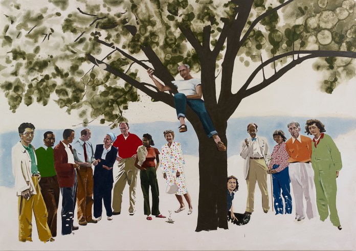
Summer Faculty, (2018), oil and collage on canvas, 190 x 270 cm
I do find myself working slightly differently now, which might be because of this even less forgiving ground. I find myself doing practices beforehand so that I try to work out how am I going to make a painting? It’s quite an old-world, formal thing to do I suppose – making a study. They are pretty much rehearsed. It seems to be the way I’m going, it used to be I would do quite rough working out things with a photocopy, kind of drawings of the paintings and then make them, bam! I’ve started working things out a bit more slowly now. Though I still wouldn’t want to over-prepare a thing though. I still want a large element of surprise in the making. I’d like to get not just what I bargained for but then some.
It’s really interesting just how you incorporate your influences, could you go into that more?
One thing that is an abiding influence on me that keeps coming out over and over again (and sometimes it’s deliberate, and sometimes I don’t realise I’m even doing it) is the Baptism of Christ by Piero Della Francesca. It’s in the National Gallery in London, I’ve been ripping it off in a thousand different ways over the years, from the puddle of water with the reflection of the sky, the colours, the plants, even the little cut tree stumps. Its funny in a way because I’m not religious one bit, but I really love that painting. It is funny to be so moved by that, but it really is a beautiful painting. That’s the thing about influences. You are drawn to and influenced by the stuff that you are already predisposed to in some way. You’re working in a certain way and you see something that really resonates with those interests. I don’t know how much it is conscious, it’s not necessarily that I say hey it would be nice to have another small plant in the foreground. I was probably inclined to that already when I saw it embodied elsewhere. But that is certainly one painting I think about when I paint.
At the moment I am very fond of the American painter, Fairfield Porter. An interesting guy, he was a writer and critic, his background was painting in New York in the thirties, he was friends with the abstract expressionists, but his influences were more Matisse and Vuillard so he carried on through all this making figurative paintings when I suppose it would have been very unfashionable but I think they are amazing. I must admit, I have never seen any in real life. But I’d like to. He was very much in my mind with some of this recent work. For years I wouldn’t have any figures in the paintings, and people would ask me where are all the people in these buildings? So, for years I was consciously going There are no people in these paintings. To allow them in now feels like a slight freedom. Allowing yourself a slightly different subject matter. Not that anyone else cares much one way or another. Ha. But these are the sorts of things you find yourself thinking about. In your own little world.

Centaur, (2018), charcoal, gouache & collage on paper, 120 x 118 cm
For example I can’t imagine myself doing this large drawing, Centaur, before now. That is Robert Rauschenberg in the check shirt and he is working on a costume for some kind of school play they are putting on at Black Mountain College, this sort of Centaur figure woman. I had just bought these charcoal pencils that came in different colours and I came across this image when I was cruising around Google images and it occurred to me that it might be a fun thing to do with these materials. Yeah it’s kind of the same sort of hard-edged careful representation with the checkered napkin collage versus these more gestural, more expressive kind of pencil marks. I’d often pocket things like the napkin when I’m out, I have a huge drawer of that sort of stuff in the studio. All kinds of different sweet wrappers and things like veneer and felt and odd bits of plastic and wood and foil. Or even just envelopes. They end up in the work somewhere along the line. Really what you’re interested in really is the materials and these kinds of formal elements. And you are finding an excuse to make one image rather than another. Like how you can just cut out a shape from a completely different context then stick it down into another and suddenly it becomes something different. And you can believe that is a jumper or a dress or whatever, even though its actually only an old crisp packet. It’s nice that you can put down so little and yet your eye can fill in so much. It’s kindly like that.
Obviously you put great importance in seeing painting in the flesh.
Realistically most people seeing your work are only going to see it as a reproduction on the internet, aren’t they? The proliferation of images of the things you make on the internet must swamp the percentage of eyeballs that have seen the thing in real life. How many actually go to a show anymore? And the show is only on for three weeks in like Paris or Germany or wherever. The proliferation of images of your work around the internet is incredible so ideally they ought to be very well recorded least. Sadly its beyond my powers to do this myself so I rely on the galleries to do it for me. My only contribution is to record details of the paintings – little incidents within them that I find beautiful or interesting in some way, that maybe allow a way in for the viewer to understand the materiality of the work. I can probably do that better (in terms of the selection, not the technical competence unfortunately) than the professional photographer recording the whole work. Sometimes though I do see details posted by other people that look great and that I hadn’t noticed myself.
When you see a painting in real life you go right up to it and see how was this made exactly? Plenty of people seem to have never actually seen paintings by the artists that influence them and in the case of say someone like Peter Doig there are some really rich complex paintings but plenty have never actually seen one. I think that it is vital to see paintings in person when possible. If you’re going to make decent work yourself, you are going to have to. Half what you’re doing is looking at how is that done? Thats where the beauty is often, in the human aspect of things. I remember going to see an Ed Ruscha retrospective and being quite moved by the sort of pathos in the handmade aspect of some of the early works. Works which you’d been looking at all your life in reproduction and never getting a hint of the wobbles and the pencil guide marks and brush strokes, gaps, scuffs and scratches. It’s really hard to get that from reproductions. You end up zooming in like mad on stuff and it’s all pixelated because the reproduction is not good enough. There’s nothing there for you.
But then again, some things work better in reproduction, don’t they? Ha.
You can find out more about Blaises’s work through his Instagram page, link below
https://www.instagram.com/blaisedrummond/
