Painting

Somewhere Between Now and Then: Shane Berkery

Shane Berkery

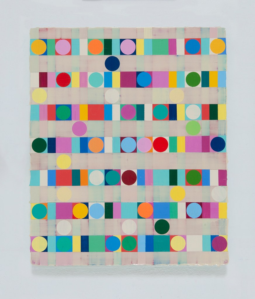
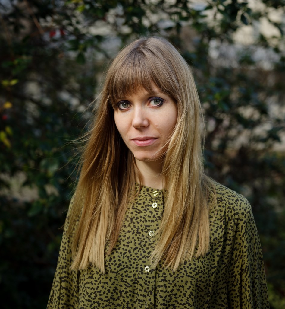
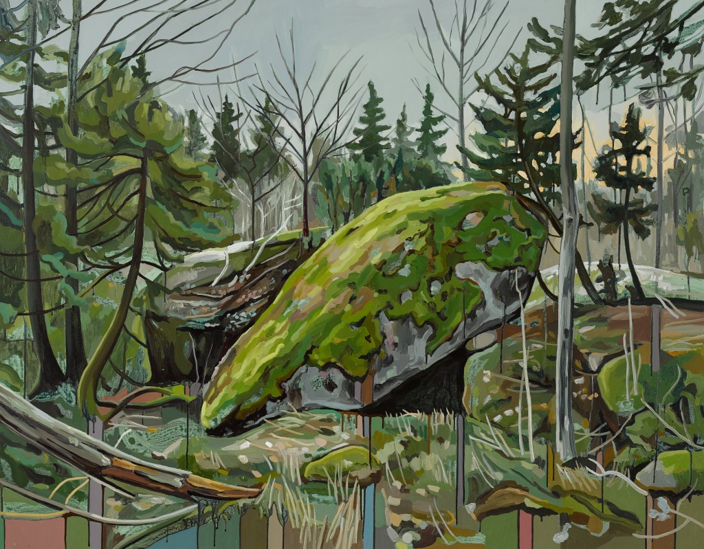
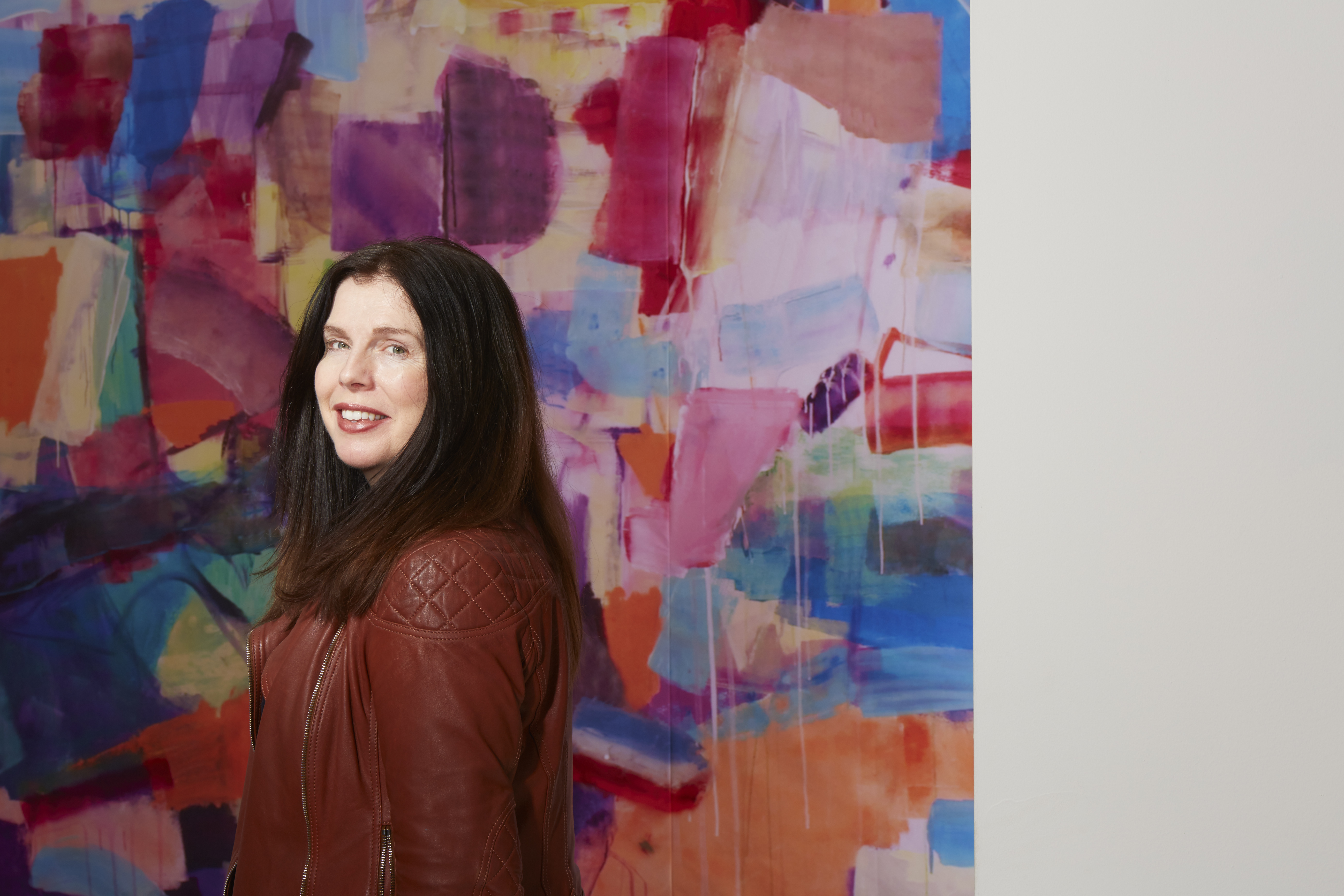
Shane Berkery is a Dublin based painter, Shane won both the Hennessy-Craig and Whyte’s awards at the RHA Annual Exhibition in 2016 and was one of the shortlisted artists for the Zurich Portrait Prize in 2019. I first came across Shane’s work around 2018 when I visited Dublin and conducted one of my regular treks of the galleries. I came across his work Somewhere between now and then as part of a group show that was in the Molesworth Gallery and it stuck with me ever since. I knew straight away that I wanted to talk him on his practice. One thing that struck me when talking to him is his drive to keep improving and keep pushing himself. In a way you could draw parallels to how athletes talk about their skills. He has such enthusiasm to explore the medium, and it was fascinating conversation with him.

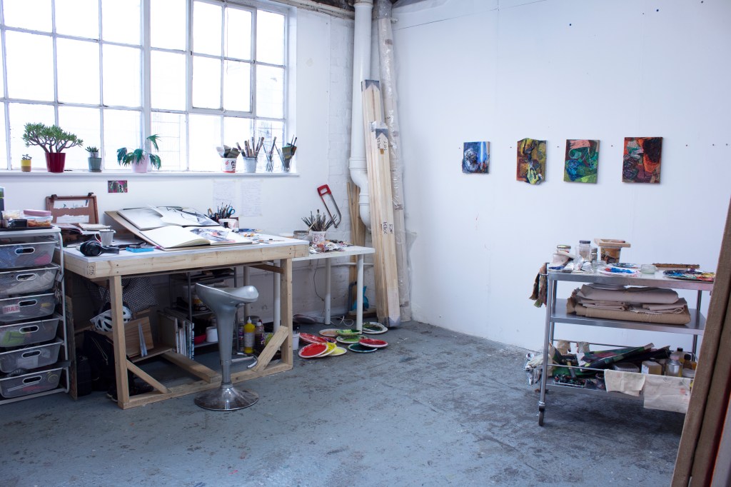
I think the best place to start would be to describe a day in the studio.

Studio shot

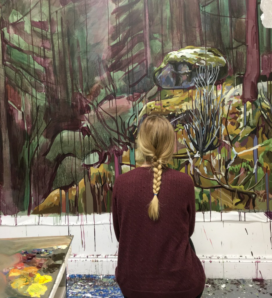
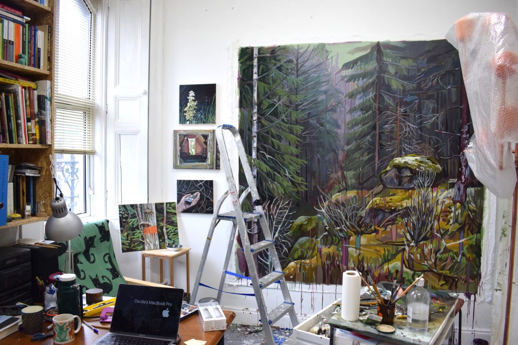
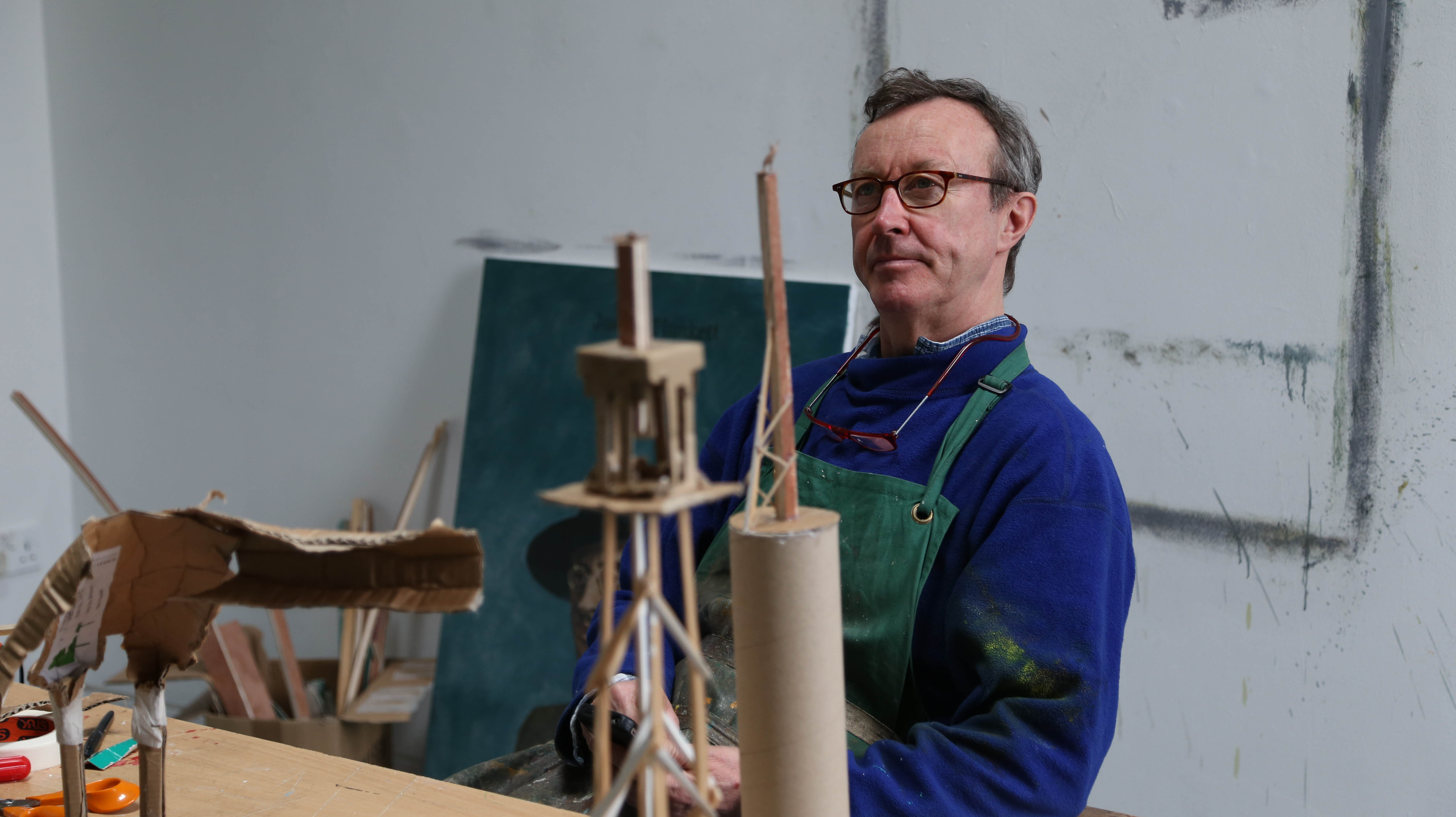
I have a studio in my back garden, so I can wake up, walk the dog and then head into the studio. I get started around 9:00, and then I just paint. Right now, for instance, I have between eight and nine paintings at various stages of completion.

So you work on a few at a time?

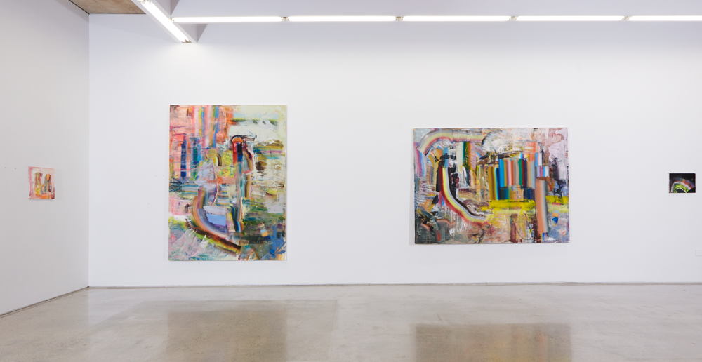
Yeah, I’ve started doing that since my previous exhibition, (Cave Paintings). Before that, I’d work on maybe two paintings at the same time, max. But I’ve started a whole bunch at the same time because I find that when working on one painting the whole time, you stop seeing the painting. For lack of a better word, you become blind to it. So it’s good to just refresh by working on something else and then revisiting when it’s dry.

Cave Paintings, install shot, Molesworth Gallery, 2020

You describe your paintings as being a result of the process, rather than a goal that you reach.

Yeah. I don’t really approach each painting as a final product. Each painting isn’t the final product in my eyes. I approach each of them as practice. My final product is what I’ll eventually be able to paint, the artist I can become by getting better and better. The goal for me is to improve. Each painting I try to do something new. I try to start each painting a little bit differently from the last.

Eventually, I want to improve in all the components of painting. I view it as a form of visual problem solving. For example, I like finding colour combinations that I haven’t used before; I like to explore colour relations when painting. Obviously, composition is something I’m always working on.

I try different working styles as well. When I walk into an exhibition, I personally like to see different kinds of paintings. I like to see how far a painter can push their style in different directions.  One thing I do want to do is get better at the representation side of things. That’s why my paintings a lot of the time have rendered representational elements to them. I still feel I haven’t mastered that.

Is there an element of challenging yourself?

I want to make something that I haven’t seen before. I think representation in the painting is a really strong tool. It draws the viewer in, and it gives a strong reference point for the viewer to place themselves within the painting. I like paintings that can do that, and that’s kind of what I want to do.  

Flower and hoop, (2020), oil on canvas, 50x50cm

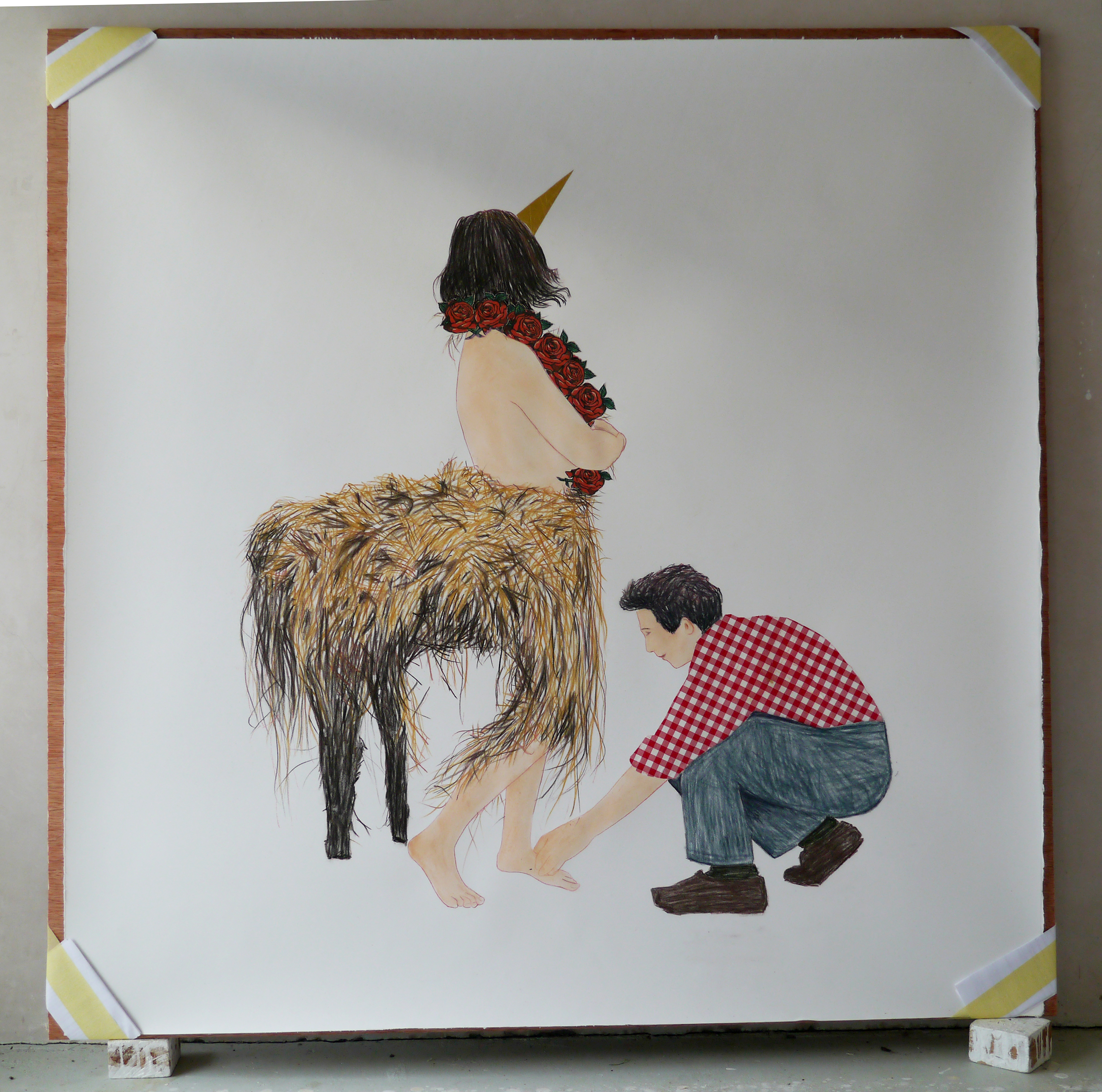
I think it’s just a continuation from when I was little. I’d just think about the figure in a painting, as an anchor almost. You can relate on a personal level. I find figures more engaging and interesting.

I think I’d feel pretty upset with myself if I stopped trying new things in my painting, so maybe it does circle back to challenging myself.

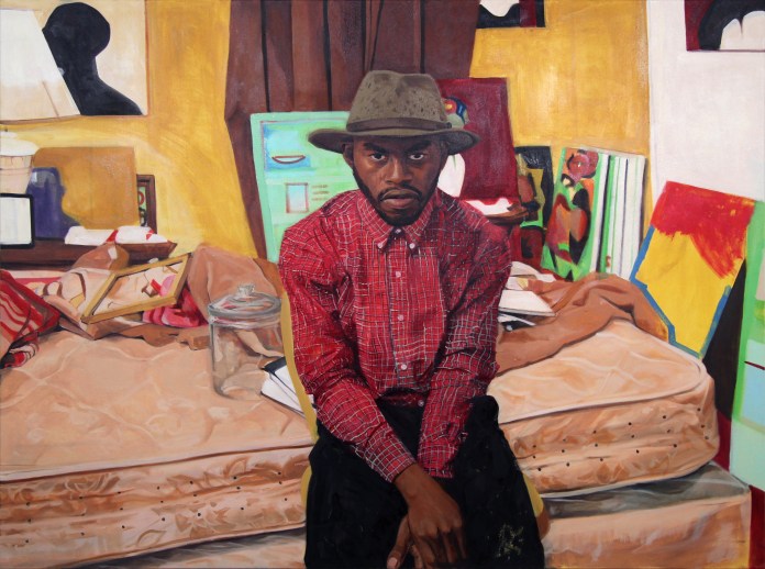
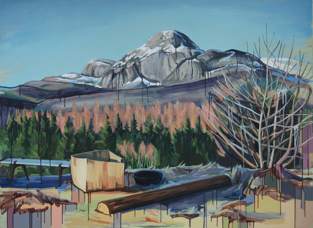
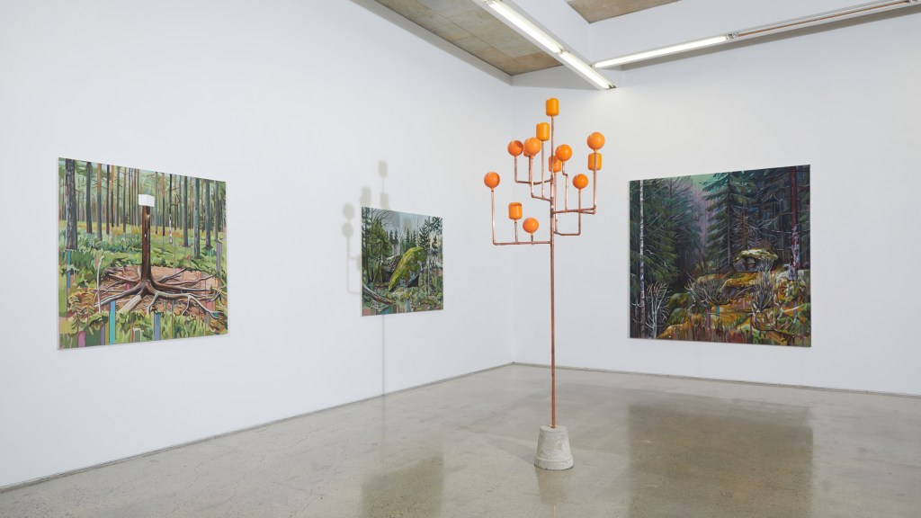
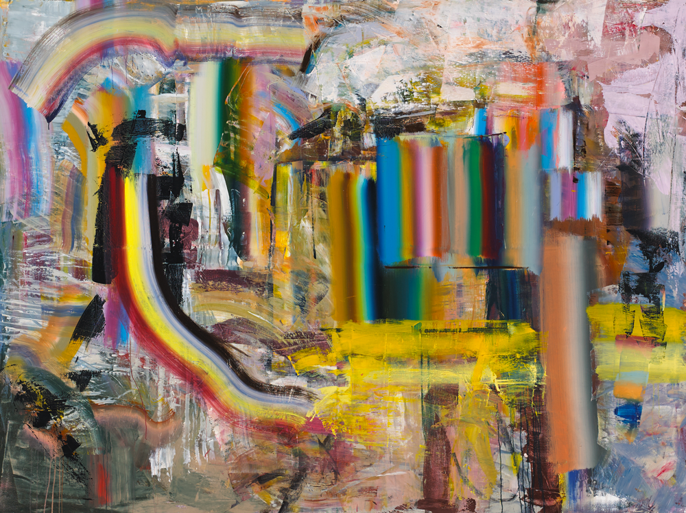
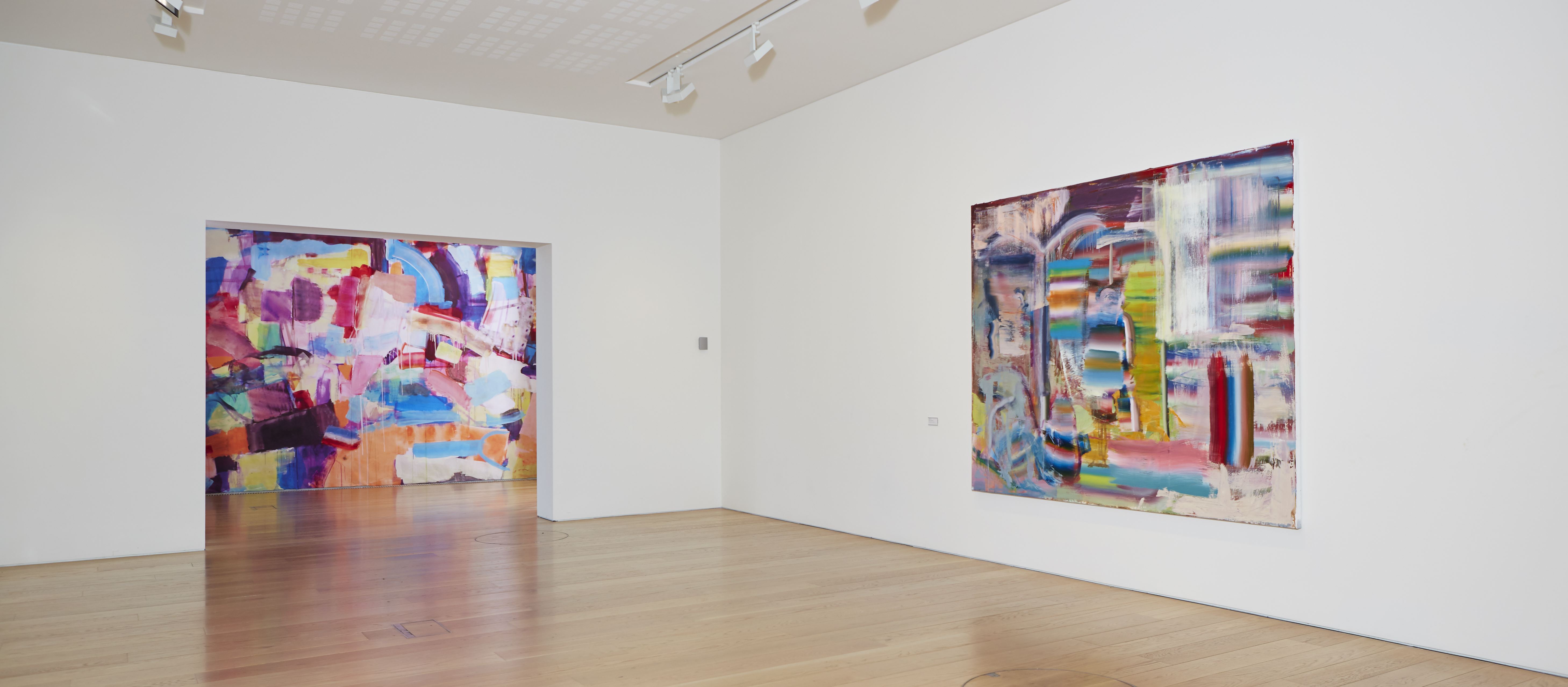
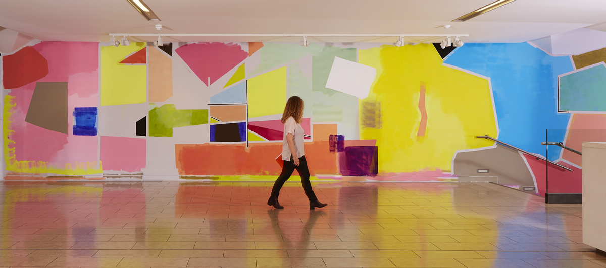
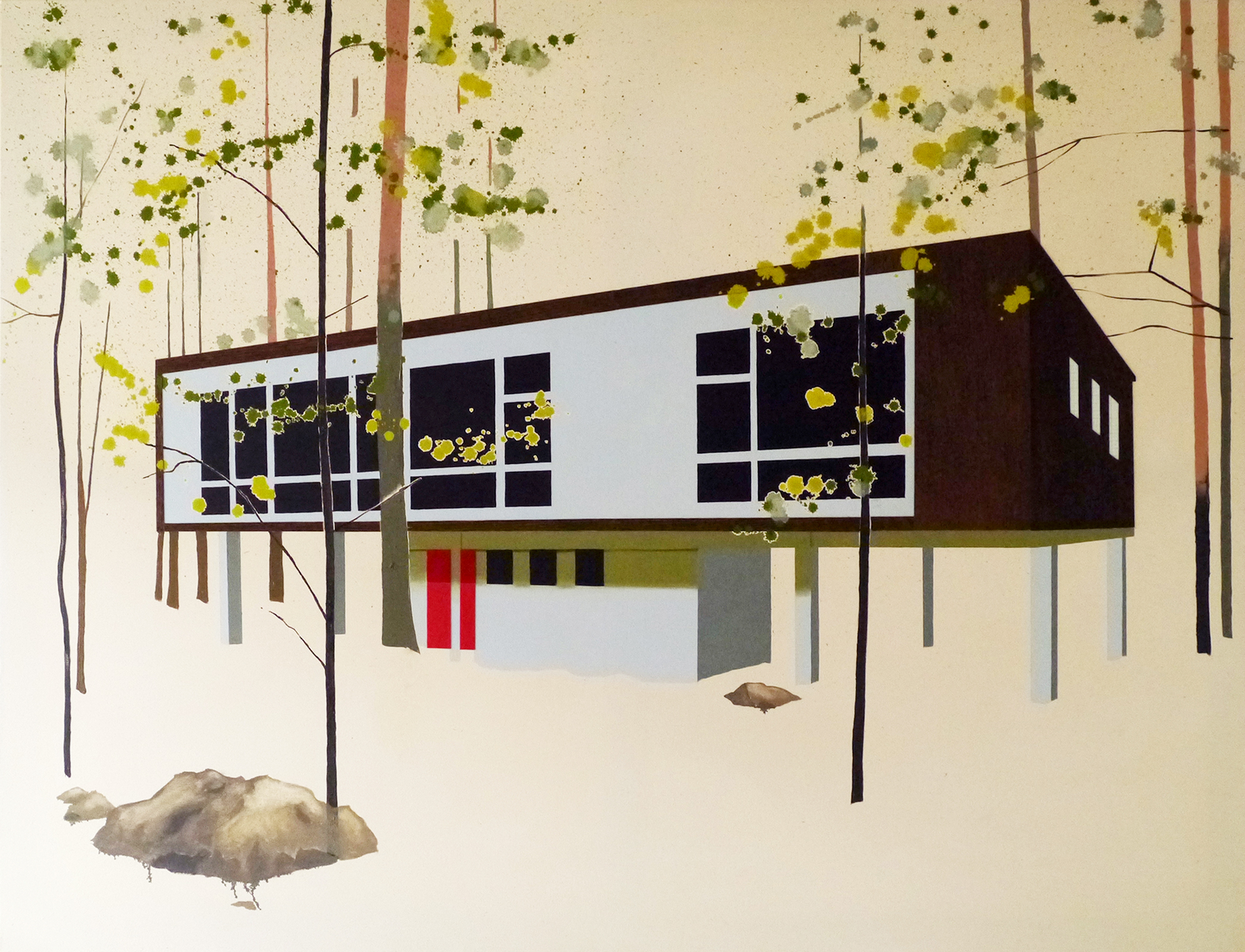
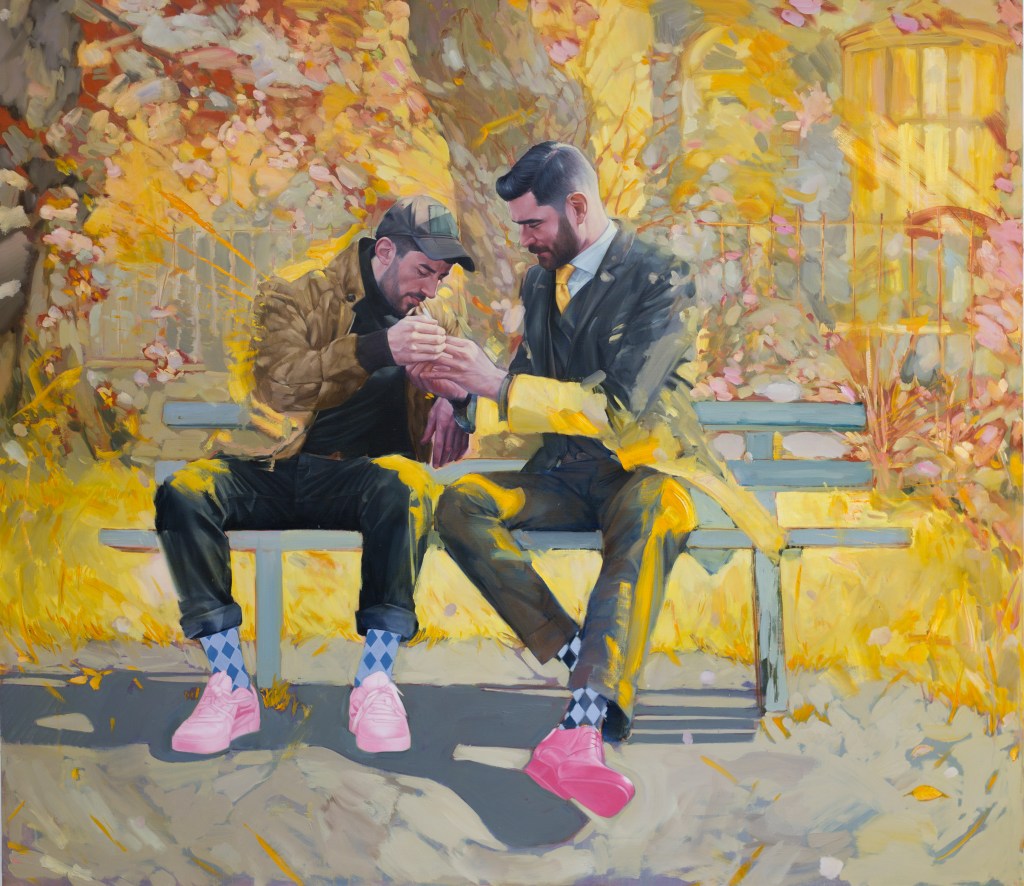
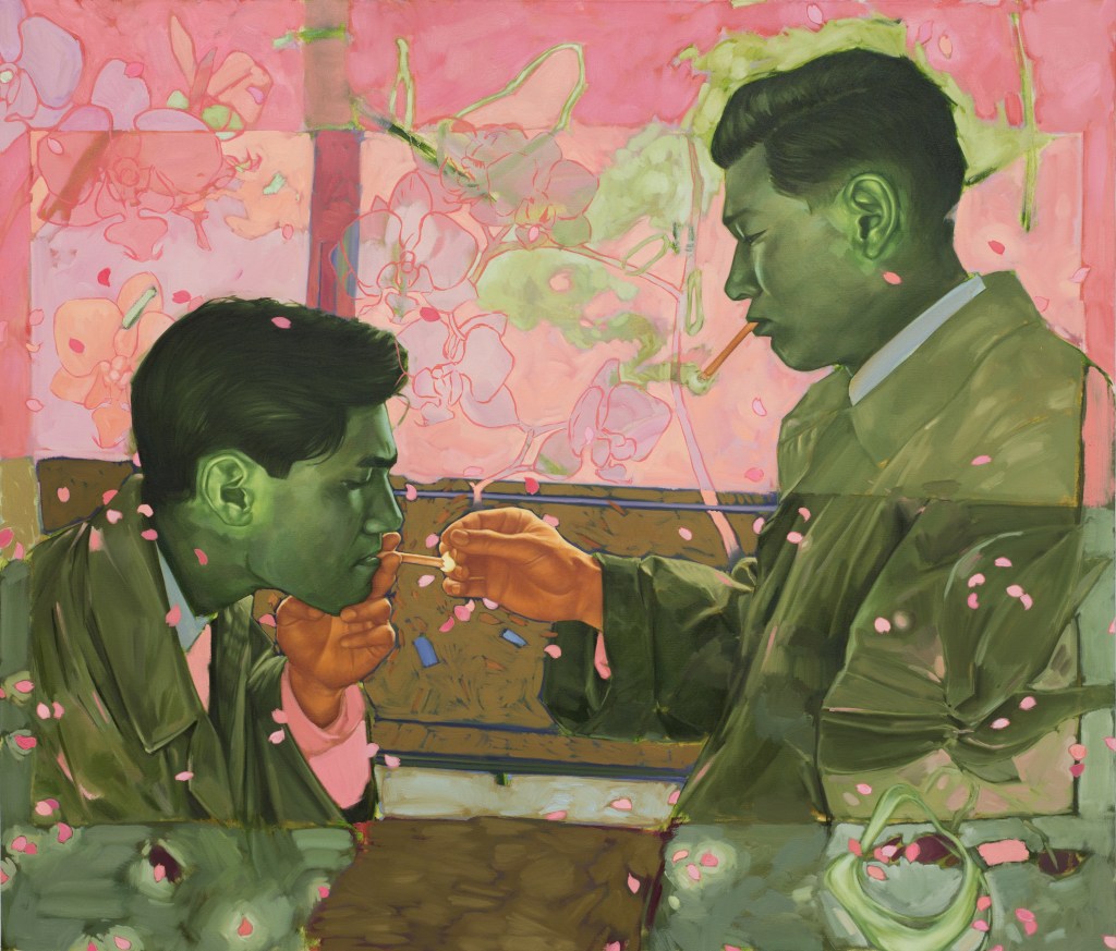
How important is scale for you in your work? I got to see A Light (2019) when it was in the Zurich Portrait Prize exhibition, and the scale really stood out to me.

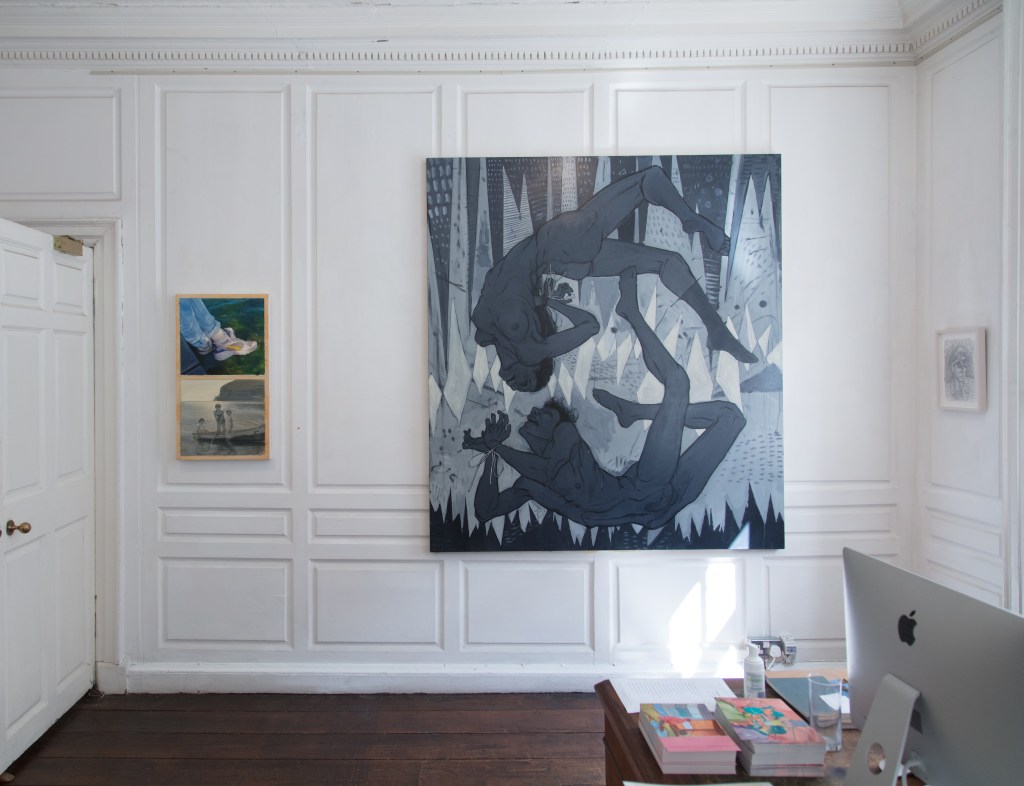
I think there is a direct relation between scale and the impact it can have on the viewer, it obviously has to be done right though. Previously I worked quite big almost all the time, but with my recent round of paintings I have done quite a few small paintings where I can concentrate on specific elements and take a more targeted approach. I’m experimenting with that as well. I do enjoy making the big paintings though.  And when I successfully do that, they feel way more fun to finish, and more of an accomplishment.

There definitely is a big difference between just seeing A Light on the screen and seeing it in real life scale, which it is. Tactility and all that disappears as well, when it’s on the screen.

A light, (2019), oil on canvas, 130x150cm

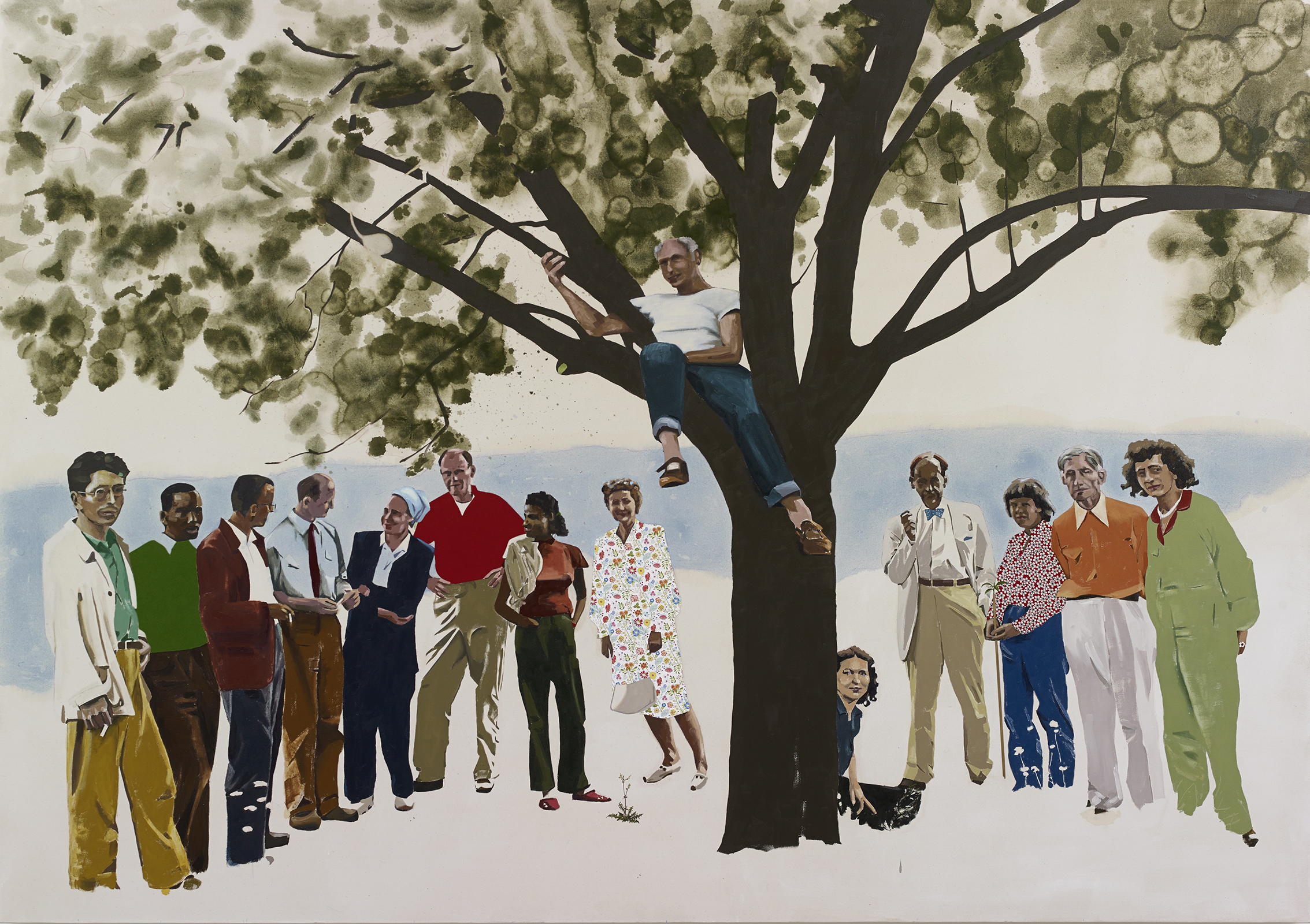
And a lot of your paintings are from your grandfather’s photography. How did you approach that?

Yeah, I came across a whole bunch of them. I don’t know how many there are, maybe two or three hundred of them? I’ve scanned so many of them onto my iPad for when I’m working.

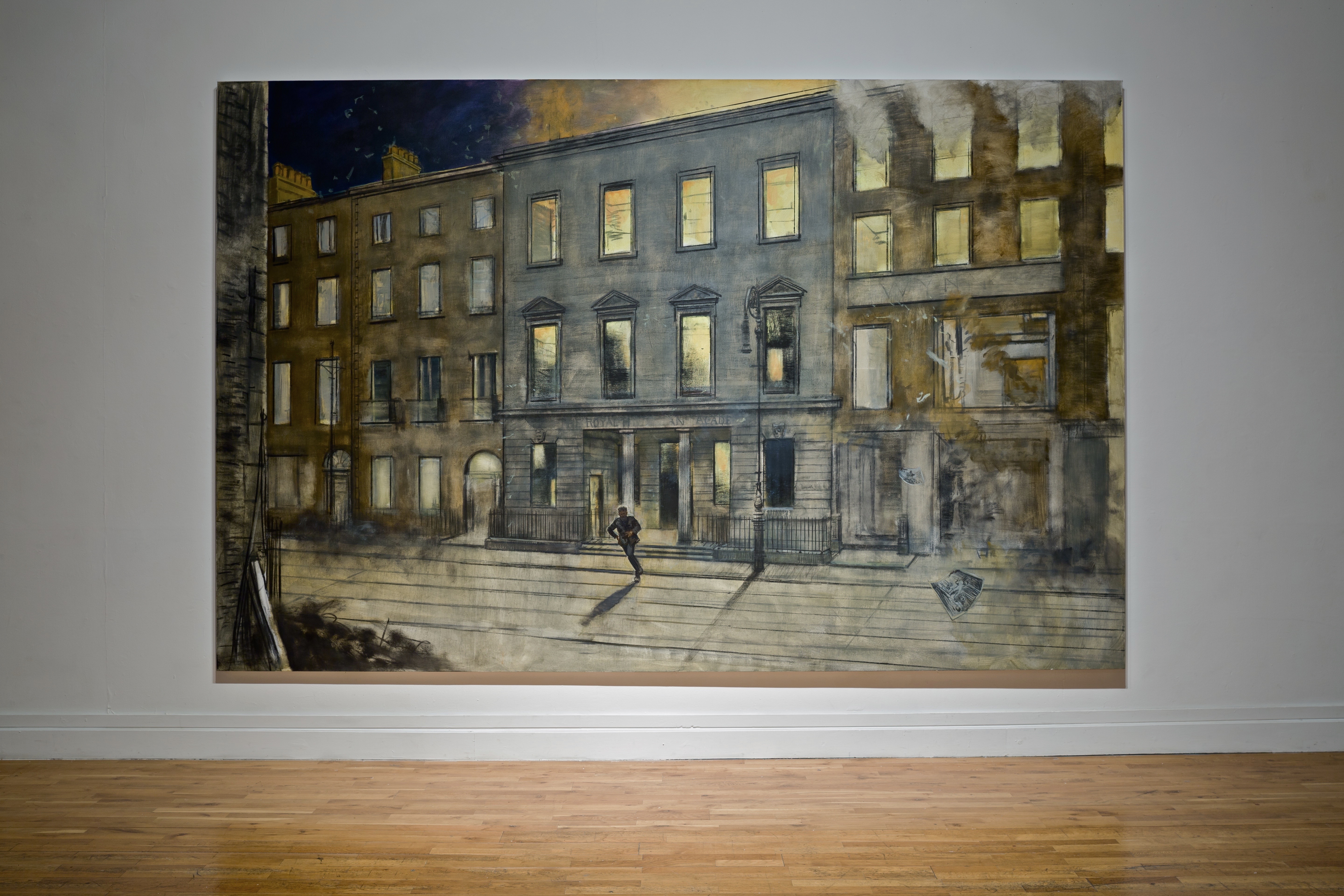
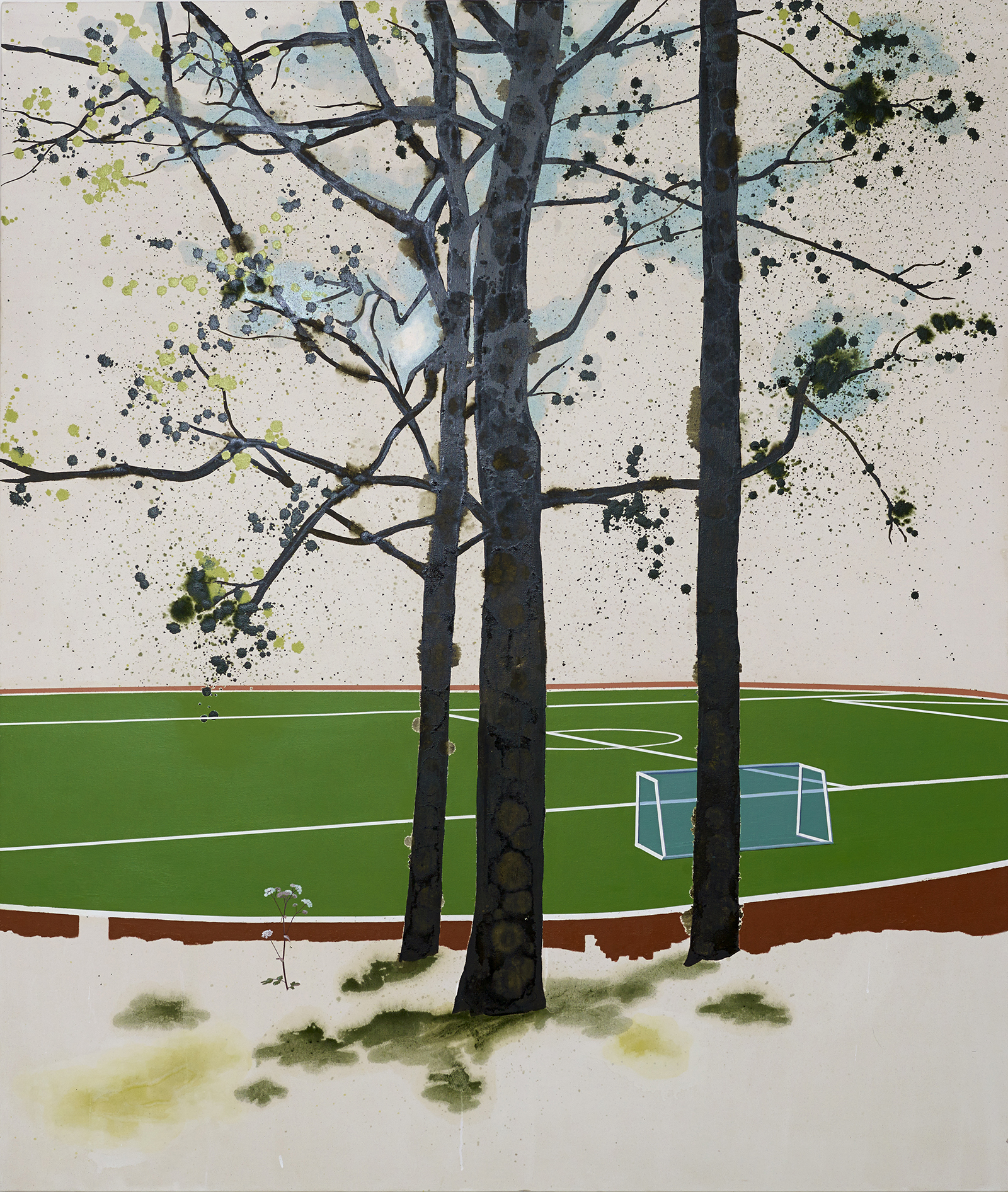
A lot of them are candid photos. The pictures themselves look like film noir stills. They were taken at a time when Japan was Westernising like America, and everyone’s wearing the suits like in the films. You see this juxtaposed against the Japanese landscape and the old traditional Japanese clothes that are still there. So, you see this unique mix of cultures that was fascinating for me.

It’s really interesting because there’s such a filmic quality looking at the paintings.

The process with black and white photos is usually, I go through all the photos that I’ve scanned until I see which photo jumps out at me, I then make a painting based on the photo – how it feels, how it looks. Once I pick the photo that I want to work from, it’s kind of like, OK, off to the races. And then I might have an idea beforehand that I want to try out, like a combination of colours, say really saturated red and green. Those colours are going to be kind of the starting point. You make decisions on the canvas, you take a colour, you go for it. And then from there it is a matter of problem solving.

photo taken by Shane Berkery’s grandfather

Do you approach your grandfather’s photos differently, compared to the photography that you take yourself?

Yeah, I think there is definitely a different feel to it. And I think one of the things is that I tend to render lifelike colour in the photos that I take, because the colour is there, and when I have the colour in the photo I want to keep improving on that as well.

Bright Light, (2019), oil on canvas, 81 x 115 cm

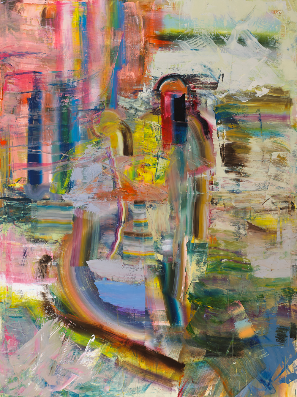
A lot of the pictures I take are of my friends, people that I know. My granddad would have taken photos of his colleagues from his company, candid scenes of them interacting. There are more formal family photos as well. A recent painting, the yellow painting (A Light) was inspired by one of the photos that my granddad took with the guy and the lighter, which I had already painted. It’s basically the same action with different figures. So I think I’m trying in a way to emulate what he’s done.

Match II, (2019), oil on canvas 105x90cm

What camera do you use?

I actually have my granddad’s old Nikon camera that he used to take the pictures. I use that sometimes. And then I also have another 35mm camera and a Pentax 67 as well. It’s from the 70s or 60s. Medium format, big old camera. I enjoy taking pictures with film more than digital. With analog cameras, there’s distance between when you take the photo and when you see it, which I think is an interesting quality to that dynamic.

I know you grew up in both Japan and America. Do you think there is an element of representing those different cultures?

I think there is a different visual sensibility between Eastern and Western countries, and I think there might be something unique in borrowing from each side. But I don’t really care too much about representing culture in my work. I mean, when I paint my granddad’s photos, I don’t see it as painting Japan. I feel an affinity to my granddad, I feel a connection to the photographs.

Somewhere between now and then, (2018), oil on canvas 127x114cm

At the end of the day, I’m going to draw from as much as I can. If something is part of my experience and the imagery is accessible to me, that will filter into my work.

You can find out more about Shane Berkery work through his Instagram page and websites, links below

https://www.instagram.com/shaneberkery/

https://www.shaneberkery.com/

thank you, Anne James for your work editing

You can support Painting in Text through Patreon, link below

https://www.patreon.com/PaintinginText

Standard
Painting

The Human Subject and Painting:Tajh Rust

Tajh Rust

Tajh Rust is a Brooklyn based painter. He graduated from The Cooper Union in 2011 with a BFA in Painting and Film and from Yale University in 2019 with an MFA in Painting. Who has exhibited in New York, LA, Frankfurt and Brussels. Tajh was an artist that I came across while I was doing research online and the way he approached gaze in his portraits caught me instantly, I knew I had to interview him. I sat down ar with Tajh late last ye to discuss his painting over a Zoom call. In that call, we discussed many elements of his practice like his approach to portraiture, specifically the relationship with the sitter in his work, and how gaze plays a role in his paintings. It was a great experience talking to Tajh about his work, he is so considered with his answers that you gain so much in discussion with him. It a great conversation with a fantastic artist.

I’ve heard that you feel a sense of collaboration between yourself and the sitters you paint.

I usually paint people who I know personally: friends, family and people who I’ve met. And having spent time with each person, you get a sense of what’s important to them. You get a sense of their personality. I don’t want to represent people through my own prism of subjectivity. I try to approach each one individually. So that entails having conversations, asking questions like what we’re doing now. And I see if I can bring some of that into the painting itself. I had a body of work about three or four years ago, and it was strictly about looking at environments as an extension of our identities. Those paintings were set in places that each individual chose themselves, so there was a personal significance. And that then became part of the portrait; my observations of the body occupying that space.

Duneska, (2017), oil and acrylic on canvas, 152.40cm x 193.04cm

I mostly work from photographs I take of the sitter in the space. I take lots of photos of the sitters because I paint very slowly. It’s tough to get people to agree to sit for that long! I tend to work from a lot of photographs, as source imagery, and then cobble together from there.

Early on, I would try to find one photograph that I could paint from directly. Then when I started grad school, I was challenged on that approach. So, now I take more liberty in the source material. I collage different moments, kind of like a Cubist approach where you can see around things, and the perspectives may not always align, but it tends to be more faithful to a feeling of that person or that environment.

Is history an important aspect to your work?

Yeah, painting has a very long history, and it’s hard to distinguish yourself from it. If you don’t know about it, are you making some of the same decisions, the same mistakes, as your predecessors? I’ve been looking more at history in the last few years and trying to interpret it in my own way, with my own experiences.

One interesting aspect of your portraits is the use of gaze.

Subject V (Jeannette), (2018), oil and acrylic on canvas, 81.28cm x 81.28cm

It’s something that I have to really think about when I approach a painting. I have a series of paintings where the figures are all looking away. And with those paintings, I’m trying to think about visibility in a challenging way, where the figures aren’t turned away completely; you still get enough of their likeness. But they’re withholding quite a bit. With those paintings, I usually start with a colour, often the complexion of their skin, and then build the painting from there. I wanted the figures to disappear into the atmosphere of the painting as a whole, but it’s hard to do that when they’re fully turned away, so I do a three-quarter turn.

With other paintings, the larger ones, I tried to have at least one figure confront the viewer, because I think it’s almost too easy to be a voyeur. But when the figure looks back at you or meets your gaze, it transforms this from a neutral act of looking to something more active. I like to play with that. I think it’s a completely different experience when you feel that you’re being looked at as well.

When you spend enough time looking at a painting, you can see how that painting was made. A big part of it is seeing. The recorded history that you can see by the edge of a painting, you know, how many layers; but it’s not like you’re going to crack the code or anything.

How has your practice been affected in the last year?

I didn’t travel much growing up, so it’s something I’ve prioritized as an adult, and I try to travel every year. It’s been challenging, because I haven’t been able to do that in 2020. I was fortunate enough to do a residency in Dakar (Senegal) back in 2019. I connect with people on my travels and incorporate them into my work. I love to go to museums everywhere I go. If it’s a vacation, I’ll find the nearest museum and see a show there. I think travel is a big part of my work, because I’m always trying to draw connections between people and locate myself within a larger community.

Rückenfigur II, (2019), oil on canvas, 121.92cm x 182.88cm

My exhibition Where We Meet came about from reflecting on some of my travels. I’d been thinking about the connections between the people I’ve met and the African and Black diaspora because they make up the majority of the subjects that I paint. So, thinking about what a shared culture amongst those people might be like. In that particular body of work, I was pulling from the residency in Dakar in 2019. It was my first time in Africa. So that’s a jumping-off point, radiating from that residency as a source. And I have also gotten to travel to Cuba, as well as the US. I was thinking about those three regions, West Africa, the Caribbean, and the United States, and trying to find connections between the people that I’ve come into contact with.

Where We Meet install shot, Mathew Brown Gallery, 2020

My practice has had to adapt a bit this year. I usually paint people that I know, people I get to meet in person. That’s not possible lately, because of the lockdowns. So, I’ve had to work in different ways. I have an extensive collection of images that I’ve taken on my travels and in my neighbourhood, and I’ll use those, but I’m working from drawings mostly now.

I’ve had to get creative with source materials; for instance, using film stills. I’ll watch a film, and pause at a specific moment that I think is interesting. And then I lay out an array of images and see if I can make a composition out of those references. I’ve been inspired by black and white films. For example, with Like Sunday I wanted to interpret what that setting might feel like, use it as a way to play with colour.

Like Sunday, (2019), oil on canvas, 101.60cm x 101.60cm
Untitled (Shadow Painting), (2020), acrylic on canvas, 71.12cm x 71.12cm

I made a couple of paintings while I was at home during the initial lockdowns. I was mostly working with drawing and thinking about what I wanted to paint, stuff that I would see around the house. I made one painting that was just shadows. I had some plants in the window, and the light was coming in through the window, and that made this pattern of shadows on the wall. And I just painted that. It was unlike anything I’d painted recently, but it was kind of therapeutic for me. It was just like, “Okay, I don’t have to worry about honouring someone’s likeness or thinking about the body in this regimented way,” so it was freeing. But it was also very difficult, because shadows are this fleeting thing that you can’t really grasp. When I paint shadows in paintings, they’re kind of made up, because they aren’t one true colour. They’re this thing that happens with light, and it’s always changing as you look at it. How do you represent that in colour? I was using acrylic paints at home, which is different from the oil paints I get to use in the studio. I don’t know if it’s a good painting, but it’s important for me because it has made me look at my environment in a different way. And it made me look at the time and paint in a different way.

I’ve noticed that in some of your works, there are older paintings within them.

It was something that evolved quite naturally over time. A few years ago, I was painting a lot of my friends as my subjects, and a lot of them are artists themselves. They would pick domestic spaces where they’d have art that they’ve collected, or their own art in the back. And I would have references to other paintings in the back as a kind of a tribute to them. It was appreciating their work by including it in mine, and it became this recurring theme. And since then, as I make more paintings, I think of how they would fit into others. Sometimes I’ll put an old painting of mine in the background of a new one, and have a dialogue. They speak to each other, which is why I try to allude to them, because they’re not separate.

Osaretin, (2016), oil and acrylic on canvas, 182.88cm x 137.16cm

So, interpretation is something that you play with a lot in your work?

I would say so, because I am very influenced by everything that I see. I consider myself pretty sensitive to my surroundings and my environment and everything I consume visually. I used to go to museums quite often, pretty much weekly, just to see exhibitions. Not just to look at paintings, but also sculptures and film and video, and I studied film in undergraduate school. I think I watch films in a different way now, having studied them and having made a few short films. When I watch films, I think of how people are represented in film and how I can learn from that to approach the subject, the human subject and painting.

My exhibition Where We Meet was kind of influenced by a quote from Arthur Jafa, at a talk that he was giving at the Hammer Museum in LA. He was talking about the way he works, and he’s a person who collects lots of images as well. He just scours the internet. I think he used to do it manually, before the advent of the internet, where you just collect images over time, making folders and books. That’s something that I have been very interested in, because I have lots of disparate interests that may not always readily make sense together, or the connections might not always be clear between them. But the way he spoke about his interest in images from all over – he said that the justification was his interest alone, and those things make sense because he is the connector. Where the ideas meet is within each of us, and our various interests. I was always interested in that as an idea.

Is this element of representing the individual, and culture, within your abstract work as well?

I don’t work abstractly all that often. It’s when I’m faced with something I can’t quite express with the body or the figures, and it’s usually in response to something happening socially, or something we experience in the real world. Instead of a figure, I’ll use maybe colour as a stand-in for people. I’ve used a spectrum of skin tones to talk about migration, or the ways that neighbourhoods and cities are built, or representation in countries and nations. So yeah, I think skin tones as colour can provide a lot of meaning. And then it found its way back into the figurative work. With the subject paintings, I often started with the skin tone.

Neighborhood, (2017), acrylic on canvas, 76.2cm x 76.2cm

With some of your works, water seems to be a recurring theme.

Surpassing Water’s Coolness, (2020), oil on canvas, 182.88cm x 137.16cm

That’s a new thing that I’m thinking through. I think water is really, really magical. And it’s hard to paint, so it’s a challenge for me. Water is such a weird, crazy thing to tackle, but I think what it immediately does for paintings like Heavenly Peace and Surpassing Water’s Coolness, is it disrupts the ideas of interior and exterior. I like that, because it immediately becomes dreamlike, or ominous, by bringing water into the domestic space. It can be surreal, but it can also allude to meaning. I think of floods – quite a literal problem that has disrupted so much. Water is a clear liquid, obviously, but I use it as a colour. I tend to paint water blue, and I think blue is such an emotive colour. It immediately sets a tone, and we all have associations with blue; I love combining it with water.

Heavenly Peace, (2019), oil on yupo paper, 121.92cm x 182.88cm

How is your work developing, going forward?

I have been interested in dreams recently, as subject matter. I have painted figures lying and sleeping in the past, and I feel that I’d like to explore what’s going on in their heads. This might help plug in a few holes in my work. I’m excited about that.

I’m painting a lot. I’m trying to get myself ready for the future. But at the moment, I just want to make some paintings that I really enjoy. And now that I have all the time in the world, I’ve got to slow down and try different things, try different challenges, and we’ll see what comes of it.

You can find out more about Tajh Rust work through his Instagram page and websites, links below

https://www.instagram.com/tajhrust/?hl=en

https://tajhrust.com/

thank you, Anne James for your work editing

You can support Painting in Text through Patreon, link below

https://www.patreon.com/PaintinginText

Standard
Painting

Movement, Lines, Shapes: Karolina Albricht

Karolina Albritch at Turps Studio October 2020 (photo by Laura Wormell)

Karolina Albricht is a Polish painter based in the UK. I interviewed Karolina over Zoom in late 2020. It was actually a friend that suggested that I check out Karolina’s work, and I am very glad that he did. I really enjoyed my conversation with Karolina; it got me thinking of how space is represented on canvas. In this interview, we talk about her painting practice and how her paintings are often responses and interpretations of external factors. We talk about the effect of the studio on her work, and we even discuss her approach to scale in her painting.

Let’s start with a day in the studio. How do you approach your practice?

I like to be in the studio first thing in the morning and have the whole day ahead of me. No interruptions, just get into it. It allows me to take my time, to think and look at what’s been done the previous day. Like warming up or stretching. Drawing is one of the studio activities that can easily shift the gears of thinking, without the pressure that painting sometimes may have.

I make notes of words that I hear or read, which resonate with me and somehow might come in useful in the studio. It might be fragments of lyrics that I’ve listened to. Sometimes it’s just a single word, that I think, “I must make a note of this.” And before I start the work, I often look through my notes, look at the words, and see if anything happens, see how I react. Sometimes it can be a physical reaction, or internal reaction, it can set things in motion.

Studio February 2021

I listen to a lot of music in the studio. I find that it helps me to disconnect from all those things that might hinder the process, and to isolate things I should focus on. So, music and dancing, amongst other things, help to get into the headspace that I need when I’m painting. A dance can simply mean a basic movement of a hand or leg, nothing too elaborate, just locating yourself in the body, a kind of kinaesthetic experience. Music and dancing have the most immediacy across the arts so they interact with you physically before being then filtered by the intellect. Music opens up a lot of ‘head’ and ‘body’ doors for me. It has an innate relationship with my work, and somehow things I’m listening to can find a way out, transgress.

It’s a multi-layered game, like a domino effect with books, with music, with painting: it’s all intertwined: the word, the sound, the line. But the music is the core layer, it is underneath the painting.

It’s interesting that you mention dancing as an influence on your work.

I’ve generally been thinking about the physicality in my work, and why it is that physicality such an important aspect of my work. It is a combination of things, of course. In a way, it might be a reaction to where we are now, as a society, and how we interact with one another, and with the world, or what these interactions have been reduced to. With digital media, the physicality is essentially wiped out so that must have a degree of influence.

Knuckle Rotation, (2020),oil on panel, 23x16cm

The shapes, the line and the movement, it’s all a constant exchange, in relation to the body. During first lockdown my attention shifted to how the body moves within the studio, and how/if that is linked and translated in the work. The series of paintings I then started developed a titling system: combining specific types of movement or direction, and body parts. All that was to do with mapping my movements within the studio and then transferring them from the floor to the wall- flipping them. The way you move about the studio floor, the way your arm might move to draw a line or how your foot might step on the ground— that creates a pattern, a repetition: a rhythm. I read that rhythm might have developed in humans as a way to unite collectively during wars and battles- a ‘battle trance’.  And I’m thinking what the rhythm is, what its function is and how it surfaces in my studio. I think my work, in many ways, is relying on this heavy, intrinsic thing of rhythm/ multi-rhythm/ syncopation. Especially syncopation. (Syncopation is the combining of rhythms)

There’s a very textural element to the way you lay on paint. Is that tied to physicality, with the use of materials like burlap?

Yes, that’s yet another layer of that physicality, which, over the years, gradually became more and more prominent in my work. I’ve started using different mediums and thinking about alternative substances that I can mix with the paint. I got my first Lukas Painting Butter maybe four years ago, and it’s become one of my go-to medium. What it does is it gives the paint a heavy body and speeds up drying. It gives it more flexibility as well.

Soft Dock, (2020), oil & other stuff on jute, 220x180cm
Soft Dock detail

It allows me to add what I want, from hair to volcanic rock. I have a box of sawdust that I’m looking forward to experimenting with. I can really play with the surface of the paintings with these materials.

Knee Cap North, (2020), oil & other stuff on panel, 30x24cm

How did that interest in materiality spawn for you?

I guess the explanation for it is more of a bodily reaction to looking; looking and thinking and processing everything that is happening around you and within you.

You experience the world through your body, through the entirety of your senses, named and unnamed, and my painting hugely relies on those experiences. The body can often act as a filter, it constantly processes the space around it.

We have talked about physicality in your work, but you also work in very different scales with certain paintings. How important is scale for you?

Yes, playing with scale is important. I recently finished Turps Studio Programme. While I was there, I had more space- larger walls, and I could experiment with larger paintings.

I’ve started painting on 220cm by 180cm canvases. Before Turps, the largest I had worked on was around 150cm. So it was a significant change. And I’m still learning to find myself on that scale. I also continue working on the smaller ones, small paintings, which are around 30 centimeters high — and trying to shift things between large and small, often simultaneously.

Studio February 2021

The small paintings are a kind of compression. It’s as if they demand more intensity, in terms of layering and in terms of detail, like snippets of something much larger.

Whereas the bigger paintings are a space you can physically enter. That space, you know, you can walk around. That scale means it’s already an object that you can spatially interact with and perceive in a very direct way, you can’t help it. It’s a different kind of an ‘entry point’.

There is this constant interaction in painting, how the body behaves when approaching these different scales, you know? From entering a painting which is taller than yourself, and then going back to something that is the length of your forearm.

These changes teach flexibility. There is an element of contraction and expansion, which continues to exist on all scales in various ways. You have to be alert at all times. I think of it as a way to challenge myself, and I like a challenge. The gesture or mark cannot be the same on such differences in scale. It’s a completely different approach.

I’ve found it very interesting the way that you name exhibitions and certain selections of works, like The baddies, the goodies & the sheriff (2020).

The baddies, the goodies & the sheriff is a group of paintings that I started working on during the initial lockdown. I had started painting some smaller works in Turps’ studios, but then they had to temporarily close because of Covid-19 restrictions. So I picked up my works, and I moved back into my old space in ASC. Something shifted when I put them up in a different space, on a different wall, in a space occupied by myself only. Divisions came about whereby some became “the good paintings, the nice paintings, the polite paintings,” the paintings that I knew how to make, and I felt comfortable making — and the other paintings, which were the opposite of those. They felt like the opposite because they were doing something forbidden (forbidden by myself…). So, if I’d look at one of the ‘nice’ paintings, I then immediately was tempted to just pack it up, take it and destroy it. Not in a physical way, not to tear it up into pieces, but just disrupt it completely, contradict it somehow.

Small Ones [formerly The baddies, the goodies & the sheriff] (2020), Studio Wall February 2021

And so while that process started happening, that was a point of departure as well for my work, because I started to experiment more — things kind of erupted. And later on, I divided the group of paintings, or they divided themselves, into the baddies and goodies, the wild ones that would misbehave and the ones that were easier to manage. And there was a painting that sort of connected the two groups, which I called  The Sheriff. The sheriff was watching both the baddies and the goodies!

No.3 [The Sheriff], (2020), oil on canvas, 30x26cm

However, these paintings now departed from my initial attempt to identify them, getting some kind of grasp of them. I now see them as simply the ‘Small Ones’ as they continue transmuting and twisting.

Before the lockdown, I think I’d gotten to a point where I was comfortable within the parameters of where I was operating. I suppose the lockdown and moving studio were the push that led to this change. And of course my time at Turps. I think I have to be 100% engaged and preoccupied with what I’m doing, otherwise the practice and thoughts slips away. I think you have to try to remain in this state of alertness, always on your guard, always be ready to attack.

You can find out more about Karolina Albricht’s work through her Instagram pages and websites, links below

https://www.instagram.com/karolinaalbricht/?hl=en

https://karolinaalbricht.com/

thank you, Anne James for your work editing

You can support Painting in Text through Patreon, link below

https://www.patreon.com/PaintinginText

Standard
Painting

Impure Things: Ronnie Hughes

Ronnie Hughes

Ronnie Hughes is a Sligo based painter from Belfast. Ronnie is also a lecturer in the local IT and is a well respected figure in the Irish art scene. I met Ronnie through local exhibition openings while I’ve worked at The Model. It was great to sit down with Ronnie over Zoom to discuss his studio practice and his views on painting and drawing. Ronnie touches on his studio practice and views on painting and drawing. We also discuss the evolution of his practice. You really get a sense that Ronnie has given great thought to the development of his practice when he talks about changes in his work. We had a really thoughtful discussion, I hope you enjoy.

Talk me through a day in your studio.

When I go to the studio, I have sets of paintings to work on. I tend to focus on two to three things at any one time. This is something I have done since I was at college. I might have a family of paintings that are related to each other but like all family members, they diverge and do their own thing. And I quite enjoy that. It’s almost like spinning plates. You are always putting a fresh problem in front of yourself.

I don’t use the wall space much unless there’s a show coming up. I have a particular space where I like to work. So, I focus my attention there and sort of blank out everything else. If I am waiting for paint to dry or figuring out what to do next, I’ll just put the work aside and use that time to sit and look and think for a while. They’re usually never too far away but sometimes, I leave them and come back to them in a month or two.

The studio is quite big. It’s fantastic to work in – especially in the warm weather – but it can be a cold studio in the troughs of winter. There are certain things you can’t do in the winter months because it’s too cold. I work around those limitations now. I figured out how to dress for the studio in winter, and I use the summer months to get a lot of drawing done because you can’t be sitting down to draw in a cold studio.

Ronnie Hughes in the studio

You have said in other interviews that the surfaces you paint on dictate the outcome of the work.

Yeah, I sometimes make a feature of [the surface]. If I’m working on linen, there might be raised bumps that I can use as marker points to make some sort of lattice structure. The painting develops from there. You can get similar types of patterns from plywood. Obviously, the different textured surfaces make a difference in themselves.

I don’t see purity as an important factor in art, generally. I feel the opposite is the case. Impure things elicit responses from people, and that is what I’m interested in. If I’m making a painting that is ostensibly abstract, it creates reactions in people, and I’m not completely in control of those reactions, but I can steer people in certain directions with my own particular use of formal elements. That’s something that I think about a lot.

Order/Disorder, 1991, oil on canvas, 229 x 241 cm

I’m interested in pattern. It has always appeared in the work in different ways. In my recent work, I’m exploring the construction of a pattern. When you think about it, what is a pattern? Whether visual, musical or psychological, it’s a structure that creates expectations for certain things to happen. And when you have that kind of structure, you can play off of it; you can frustrate the structure or use it to unleash something else. Even before I went to college, I remember reading about the Golden Mean [the Ancient Greek ideal of a desirable middle between two extremes], when I was an A Level student studying art. I have read a lot about it since. For me, it’s extraordinary that there are certain types of pattern relationships that run throughout almost everything. There is a book by [lecturer and water researcher] Theodor Schwenke called Sensitive Chaos which is about that idea. I find that all fascinating. It feeds into my work.

Commute I , (2020), Acrylic co-polymer on plywood, 93.5 x 73.5 cm    

You have mentioned in the past that paintings should be viewed as objects. Could you explain what you mean by that?

The Space Between, (2015), acrylic co-polymer on cotton, 188 x 183 cm  

Well, I think it’s important to say that paintings are not just two-dimensional. I think it’s a bit reductive to talk about paintings in terms of two dimensions. And I suppose the likes of [essayist and art critic] Clement Greenberg who talked about the flatness of painting, would have set a precedent for this. That may be of interest to some people but that was never the case for me. Like a lot of painters, I’m profoundly interested in the materiality of what I’m working with. It’s not this two-dimensional surface. In fact, it’s the four-dimensional character of the work that really fascinates me. What I see is that the work holds time within itself.

Some believe that abstract art encourages people not to think. I don’t really agree with that. I think of my paintings, in cultural terms, as prompts to reflection or contemplation.

Totem, (2009), colored pencil/ paper, 158 x 141 cm [Installation shot Goethe Inst, Dublin]

The process of how a work was made is embedded in its surface in various ways. If you look closely at a Rembrandt, you can actually see the evidence of touch. You see the making of the work even though it was painted a long time ago. It’s still held within it, and I like that about painting. That kind of intuitive thinking. I’m very conscious that I’m making a thing. There is a big difference in looking at a painting and then seeing its reproduction as an image. Nowadays, most will see it on a computer screen. Even when I’m documenting, I make an effort to retain that sense of the work as an object – lighting it with a particular shadow for example. For me, it’s really important and it’s hard to even say why. I’m certainly very conscious of the depth of the structure and what happens on all the sides of a painting.

It’s interesting that you mention time captured in the object because I often perceive a sense of immediacy when I look at your paintings.

That’s funny because there really isn’t a lot of immediacy in my process. A few years ago I had to catalogue all of my work for my website. I routinely take photographs when I’m working on the different stages of the paintings, mainly for comparison’s sake.  There is a level of objectivity in seeing a painting on a camera screen that isn’t possible when standing in front of it. I’ve used other ways too, to almost sneak up on paintings and try to see them objectively. I find myself looking at them in mirrors and through windows. When I was sifting back through these images, I was horrified to discover some paintings had taken me five years to make and I hadn’t realised! They keep on mutating and there is so much going on that I don’t always notice the time frame.

How did the switch from oils to acrylics come about?

Revise, Amend, Replace, Translate, (1994) Oil, wax, acrylic on canvas, 213 x 244,

My earlier paintings were very physical, and the technique I used called for bucketloads of paint and turpentine. At a certain point, I started to have problems with my breathing and contact dermatitis. My hands would continually be covered in paint and solvent. I had been working with oil paint for around eight years, so the switch to acrylics created quite different outcomes. It was challenging but there were a bunch of advantages to it – particularly the drying time. Before, I might have poured something on to a painting surface and waited two weeks for it to dry. I would have had these large paintings occupying floor space in the studio that I was paying rent for – twiddling my thumbs for two weeks. There’s a big difference between two weeks and two days.

Have acrylics become an advantage to your productivity?

Plinko I, (2020), acrylic co-polymer on plywood, 36.5 x 30 cm

I don’t know if it was an advantage or disadvantage but certainly a change. I had more control over the amount of pigment when I switched to acrylics. I could decide how opaque or translucent I wanted the paint to be. And I could control the finish – whether it was gloss, eggshell or matte. I could make a kind of textured glaze; those types of things were important to me. But at the same time, I missed the consistency of oil. Whatever your mix, the colour of oil paint doesn’t change as it’s drying. The fact that acrylic changes tone is still a pain. You could be trying to correct something and think you’re all done but when you come back in a few hours, it’s slightly too dark. Oil stays open [to reworking]. But generally, I don’t mind. I’m used to working with acrylics, and I have a grasp of them now. All mediums have their pros and cons.

Drawing is an important part of the process for you. You have said that it is more central than painting…

Hybrid Cabinet, Installation shot Hugh Lane Gallery, Dublin, 2010

Around 2006, I started making an awful lot of more drawing work. I’ve never been a person to keep notebooks. It was never for me. I teach now, and I know for some of my colleagues, it’s very important to maintain things like journals. I can see how it’s important – my wife is an illustrator, and she draws furiously in journals – but I have always felt that, if I have the time, I want to make things out in the world. I did a couple of residencies in New England, in Vermont and Connecticut, back in 2006 and when I was there, drawing became very important. I started to draw much more freely, not stopping myself from drawing in a representational style. Things like signs from gas stations, trees and various objects. I ended up doing this whole extended series of drawings. It became something quite freeing for me when approaching a new painting. I suffered before from the temptation to keep developing a painting. In painting, you don’t have to do things in the exact way that they should be done because you can always do something else with the work tomorrow. The drawings were a lot more precise. By their nature, they don’t give you the same license to make mistakes and revise.

Assorted New England drawings, Installation shot Irish Museum of Modern Art, 2008

That particular mentality of precision became part of my practice in the studio. When I got back again, I started fostering a more drawing-like approach to my painting – in the sense of drawing something out from the process. I have been interested in that act of expressing something that is hidden or latent throughout my entire career. Looking back at my degree show, I made figurative paintings but they were about plants and natural forms growing out from figures. This idea of nature coming from within has always been there in the work. Those theological questions of randomness and design are of interest to me.

Lull, oil on canvas, (1988) , 183 x 244 cm, [degree show]

Has your role as a lecturer influenced your work?

Around eight years ago, I had to deliver a series of design lectures about visual literacy. That helped crystallise things for me because I had a lot of vague notions about that stuff, and I realised then that you can’t really get up and share vague notions with a class of students. I had to go and read about things like Gestalt psychology, how we perceive images, formal aspects and other factors that help to construct meaning. I began looking at various modes of perception – subliminal as well as conscious. That has also caused a big shift in the work over the last few years.

I had a show in Los Angeles back in 2011, and I remember the gallerist saying that he had never shown work as formal as mine before. That really shocked me at the time. I thought, “What? You don’t get the work. It’s the opposite of that!” Having thought about it since, I realise that it is formal work in many ways. I’m using a particular, reduced set of elements to orchestrate things. It’s important to stress that that doesn’t preclude allowing various types of associative meaning, or representations of sorts to enter the work! I have always thought of my work as being more akin to poetry than to prose. Poetry involves fewer formal elements in a way that suggests more possibilities which aren’t so forensic or specific. You could say the same about painting, and that’s what I like about it.

You can find out more about Ronnie Hughes work through his Instagram page and website, links below

https://www.instagram.com/ronniehughesartist/

http://www.ronniehughes.net/

thank you, Meadhbh McNutt for your work editing
You can support Painting in Text through Patreon, link below

https://www.patreon.com/PaintinginText

Standard
Painting

Constructed Wilderness: Cecilia Danell

Painter Cecilia Dannell, Photo by Conor Horgan

Cecilia Danell is a Swedish painter based in Galway. Cecilia graduated from the same Honours Degree in Fine Art (Painting) in GMIT that I studied just before I started there. That is important to me because Cecilia was one of the first artists that I was aware of that had taken a similar education path to myself and was making a name for herself. Seeing her succeed was hugely motivating to me because I felt it reinforced and validated some of the choices I had made. Much like when I discover an artist has a connection to Sligo or Braintree, I get a rush when I discover an artist has studied the same course as me! Cecilia was so generous in this interview, so much so that it was extremely hard to narrow down the final text. There was a lot of deliberation of what to keep and what to take out! I have gained such insight into her practice, and I hope you find it equally illuminating

I feel the best place to start is with is a term that I have seen you use when describing your work: “Constructed wilderness.”

Yeah, because I am very interested in this idea of the romanticist trope of the wilderness as being something that we all strive for. You know? The original context of where we are from. But nowadays, what we might perceive as wilderness in a photograph or in a painting is actually just someone’s back yard! Basically, a lot of times when I am painting, I’m just searching for the different things in the landscape that can disrupt that notion, like remnants of human activity and hunters’ blinds, or just bits and pieces that can disrupt that whole idea of wilderness.

I remember I was in Norway for a residency, and I was painting the Norwegian scenery. The paintings looked as if they were right out in the wilderness, with their mountains and valleys and all that kind of stuff, but they were actually just the view from directly behind the residency centre where I was staying. It was right at the back of a little town, so it wasn’t really the wilderness, it was managed forestry. Still, depending on how you framed it or how you took the picture you worked from, you could stage it so that it looked like the wilderness. If you took the picture from the opposite direction you would have a view of the town, so I was very interested in how we construct narratives. For me, painting is not like a documentary. A painting depends on how the painter decides to frame it or how it’s presented, so I think a lot of my work is drawing on inspiration from theatre sets and constructed things in landscape and stuff like that.

This Blue is Sky Wide, (2016), oil and acrylics on canvas, 137×188 cm

I heard that you make journals as research for your paintings. Could you talk about that?

Basically, my research journal is for when I go over to Sweden. When I do research in nature that leads to the paintings, I often go on walks. While I am doing that, I make maps and write notes on how I felt that day and what the walk was like. Some painters do little studies in preparation for painting, but I don’t usually do that. I find it doesn’t help me. My preference is to work stuff out on the canvas. Because my painting scale is so big, the marks I make in the sketchbook would be a completely different gesture to what I do on the canvas anyway. My journal is mainly little thoughts, and notes. Every few months I tend to write a journal entry about how a particular work is going and concerns I have, so it’s more collecting little ideas.

Have you thought about presenting the journals with the paintings?

Because my work is so staged, I’ve always felt that I don’t think it’s that important to pinpoint exactly where something was made, because it’s not documentary. In the journal, I might have all these maps that pinpoint my walks, and different locations paintings are based on. I don’t feel that it adds that much to the viewing experience. If they have never been there and they don’t know the place, is it essential to see exactly where I was when it was made? If they don’t have the full understanding of that place and they only see the abstract map or snippets of text, are they going to get the understanding of that place? I don’t think they would. In that sense, it’s more for myself, but I tend to show it to people who might be writing about my work. Sarah Searson wrote a text about my most recent exhibition. I showed her snippets of the diary, the process, stuff like that. She referenced some of that in her text. I often talk about it, but I don’t really feel that it is necessary to show the whole thing because again, I don’t see my painting as documentary.

Example of Cecilia Danell Journal

Your paintings are predominantly of Scandinavian landscape. How did that come about?

It’s funny actually you bring that up, I had a conversation about this when I was in Paris on residency. Each morning, most of us had breakfast together, and I was talking to Olwen Fouéré, the actor/director. We were talking about the idea of landscape and place and how people can identify with different kinds of terrain, and I think what it boils down to for me is that I grew up in the countryside in Sweden and spent a lot of time in its forest landscape. I think depending on where you grew up, that place can kind of resonate with you, because when I was talking about this with Olwen, she said that she is from Connemara, and her childhood would have consisted of vast open spaces; when she is in a forest she gets claustrophobic, because she needs that space and to have a clear view of the area around her. Whereas when I am in an area that is too open, I feel put upon, I almost feel like I need that shelter of the woods. For me, forests are almost enveloping or nurturing because I have grown up with that kind of landscape. Even though it is strange in some ways, given that I have lived in Ireland for 16 years. I think it is also the fact that I live in Galway City that I don’t really get out and into the Irish landscape, and I don’t drive, so I don’t go into Irish nature that much other than what is in close proximity to Galway City. It’s like something from the forest landscape has imprinted in me somehow. It was most interesting hearing Olwen say something similar about open spaces.

I Seek the Gold of Time. (2019), Oil and acrylics on canvas, 160×130 cm

When I return to Sweden, I try to not get trapped in the idea of nostalgia because I don’t want my paintings to be nostalgic renderings. The paintings are what I walk and experience now. I’m not looking back at childhood photos and trying to paint them now. I am very aware of the fact that I am translating an experience that I am having now, but it is in a place that I am very familiar with.

Now would be a good time to talk about your approach to painting in the studio.

Cecilia Danell in the studio, Working on Make the Darkness Shine

I work with a large canvas, in the studio with a printout of a photograph that I have taken myself, of places I have been. I refer to that, but I print it relatively small, so you can’t really get the minute details. I never do grid systems or projections or anything like that. I always draw the image quite loosely, entirely freehand on the canvas first. When I paint, I allow for drips and the looseness of acrylic to create a framework for the oil paint. Even though a photograph is referenced, it is never a complete rendering. It’s not like I draw it up like a complete drawing and refer to it.

Studio July 2020. Working on Make the Darkness Shine

What do you want the viewer to get out of the work?

I set a Bait for the Unknown Installation shot Kevin Kavanagh Gallery, 2020

I think where the viewer is in a space is something that I am always conscious of when I am painting. I am standing when I work, ‘cos the paintings are so large. I’m always moving back and forth within the studio when I am painting. I always make sure that I step back to see if something properly works from a distance, making sure that I still have something I feel is exciting, both from a distance and up close. I suppose it is the same when I go to a gallery myself as a painter; I always go and scrutinize details in a painting, but I also step back and look properly, so I want people to have a similar kind of experience. Sometimes I can get disappointed by a painting I’ve previously seen online. It is great when you see it on Instagram, but when you go check it out in a gallery it is really flat or doesn’t do anything when you see it in real life. I always think a painting should work on multiple levels. There should be something interesting to see if people go up really close or step back. That is what I try and achieve, anyway.

Hinterland, (2019), oil and acrylics on canvas, 110×140 cm
Hinterland, detail

So scale ties into that?

I think for myself when I am painting in a large scale, it is interesting to me because it is almost like I am there in real life, it’s like I can step into the painting in my mind. I am interested in specific areas within the work where interesting things happen. If you look at them zoomed-in, you see something that is abstract. The painting that you see when you take a step back, it seems more almost photorealistic compared to what you see when you look up close. I like that push and pull, because a lot of people who don’t see my paintings in real life, when they see a really small photograph it can look like it is way more photorealistic than it really is. And when they come up to see it, they notice that it is quite abstracted in parts. I love being able to play with paint and not just be rendering a photo perfectly, but rather going with the different aspects of oil paint. Oil paint has distinct qualities, so that makes it interesting for me.

You don’t make many small-scale landscapes. Why is that?

I suppose I’m not someone who enjoys too much teeny, tiny detail. I love working in such a way that I have to use my whole body when painting. And being gestural, and I suppose when I’m doing the drippy kind of acrylic, because of the velocity of the acrylic paint, a drip will always be kind of the same width; even if you were doing drips on a tiny canvas, it would be really, really large in comparison to everything else. In contrast, if I work on a large canvas, I can play around a bit more with different types of paint application. Stuff like that is why the most interesting format is working large.  I find most of the time when I am working on oil paintings, specifically when I am making small works, I don’t make the landscapes. I usually make kind of close-ups of various things in the landscape.

Birch, (2018), oil on canvas, 27×35 cm

I always find with oil paints specifically that it becomes very finicky and minute for me when I try and work too small. It is an entirely different method of applying the paint, and it feels relatively restrained. I still want to make painterly gestures even on a small scale, and for that it is better to work with more zoomed-in areas. Still, they would be different now. I have been doing landscapes as the tiniest watercolours during the lockdown when I couldn’t get into the studio. It’s a different medium, with another way of painting, but I like to be able to use gestures and things like that when possible.

Notebook watercolour 10th May 2020
Giant Hogweed, (2019), mix-media

Sculptures are something I make quite continuously. Not all the time, as they tend to be made to have conversations with the paintings. They are meant to be paired with the paintings in the vicinity that are dealing with similar scope and subject matter, but the sculptures are always a bit more abstracted in a sense. They’re not made to be overly realistic. They are more like theatre props, stylized kind of gestures. To be honest, I don’t consider myself a sculptor. At least not in the typical tradition. All sculptures I make are out of very mundane materials; some of them are fabrics, dowels and bits and pieces I find in DIY shops. So, the sculptures are more ephemeral. I would say painting will always be the main thing; the other practices complement my work.

I set a Bait for the Unknown Installation shot Kevin Kavanagh Gallery, 2020

In other interviews you have mentioned that you want to draw attention to the process of creating. Could you talk a bit about that?

Yeah, it has been something I’ve been interested in. I can trace it back to third year in college. I’ve always been very interested in the process and the layering of experience and how one work leads to the next. And I often don’t know what I’m making from the get-go, but one piece informs the next. I always think in my work I’ve been trying to reference the process when I’m painting; you can often trace the process of the painting by looking at the edges. You can see the layering on the canvas, so I’ve always been interested in leaving those clues in the work.

I often use complementary colours and colours that aren’t actually there. I try and find a balance so nothing stands out too much unduly, and I think a lot of times when I work from photographs, I’m very interested in aspects of the photographic print that you don’t have in real life. For example, sometimes when you take a photo of the shadow area, that shadow can look purple almost, because of the way the camera translates it, or if you look at tree branches against sky, you might get a blue border between the branches and the sky itself, and those kinds of things only happen because of the way the photograph renders it. Those are the things that I draw inspiration from, another source for me, looking at the unreality of the photographic image while I work. I’m still always very concerned that I want them to be finished pieces, and I don’t want to show work that isn’t completed. I like the process of making to show through a completed piece.

I always like my work to function on different levels, depending on the viewer’s own experience. I think that someone should be able to come in and see my work and just take it on face value and enjoy looking at it. You can also have someone who is a little bit more clued in, who wants to go up close to the paintings and understand them more. Because I tend to read quite a lot, there is a certain theoretical underpinning to some of my work, but I don’t necessarily feel that every viewer needs to know all of that. Whereas if someone does, it adds an extra layer. I always find it interesting that people of all ages have different knowledge bases; they can take many different things from the work.

You can find out more about Cecilia Danell’s work through her Instagram page, artist page on the Kevin Kavanagh Gallery website and Cecilia’s own website, links below

https://www.instagram.com/ccdanell/

https://www.kevinkavanagh.ie/artists/30-cecilia-danell/overview/

http://www.ceciliadanell.com/index.html

thank you, Anne James for your work editing

You can support Painting in Text through Patreon, link below

https://www.patreon.com/PaintinginText

Standard
Painting

A Lingering Question: Harry Walsh Foreman

Harry Walsh Foreman

From an early age, I have been a huge fan of comic books of all kinds. It might have something to do with the fact that I have dyslexia – and comics, with their illustrations and structured panels, were helpful aids when learning to read. Comics had such an impact on me that when I self-published a book about my dyslexia, I did it in the form of a comic – for me, it was the only way I could explain something intangible like the experience of living with dyslexia. 
The comic medium is such a useful tool for conveying information, and Harry Walsh Foreman is keenly aware of that in his practice. The humour can often belie the intelligence behind his work, and getting to talk to Harry revealed the amount of theory behind his practice. It was an eye-opening (not mention hugely enjoyable) experience sitting down with him to discuss.

Talk us through the construction of your pieces.

My practice always starts with drawing. Since lockdown, I have mostly been drawing from home. During my 2km walks, I would walk to the park and get a coffee, and try to absorb the personalities of the many people that I come across. I like to think of myself as a flâneur or a man about town. I like to wander. I’ll often see somebody with an interesting face or walk, or a hunch or something. I’ll then try to recreate that later from memory.

I draw en masse. When I have an idea of which drawings I want to include in an installation, I stick them together in a very rough zine. That helps me to decipher an order and see how it reads. From there, I take the figures out of the drawings and redo the illustrations, maybe change the background somewhat, and print them on large stickers. 

I used to make and publish a lot of zines. I mostly make them for myself now. I like reading and collecting zines but there is something very insular about that experience, you know? I wanted to make work that people could experience together. That’s why I started to take narrative elements from my zines and expand them into installations. I like that the stories can be interpreted together by a group of people at the same time. 

Daily lockdown scribble notebook 1, (2020), Pen and ink on Bristol board, 29.7 X 21 cm

There is an American comic book artist I’m kind of obsessed with called Scott McCloud. I love this piece he did with [American comics artist] Stephen R. Bissette back in 1990 called a 24-hour Comic. Each of them would create a frame, and that frame would capture an hour in their life. Scott would do a frame, then Steve, back and forth until they had 24 hours of their day captured. Drawing is also like a visual diary for me. I can see a sort of evolution of the people I’ve documented over the years. These are people I come across regularly but because I’m drawing from memory, only snippets of their personality come through.

Your work utilises text quite deftly. Does the image or text come first for you? 

The imagery comes first. The text is gathered separately, and I then incorporate it into the drawings. From there I improvise on the fly, really.

I’m constantly taking notes. If I overhear conversations on the bus and I don’t have a notebook, I try to remember them from memory. And when I get to the studio, I recreate them. I might expand on things, make them more a bit more linear and digestible. Sometimes I edit the text around the drawing. For example, there was one large black and white drawing that I did in the Futures exhibition at the RHA. It featured a conversation I overheard at the coffee shop on Francis St; one woman was giving out about the fact that her daughter who worked at the post office couldn’t afford to go on strike for a day. I had this drawing of an elderly woman and I thought, “You know what? This is perfect.” So, I reworked the text as if it were something she was saying. If I was carrying around a notebook and slavishly drawing these people in real life, I don’t think I would feel as comfortable changing what they are saying or bringing in something I overheard somewhere else. I’d feel like I would have to represent precisely what had happened. 

That Little Madame, (2019), Pen and ink on paper, 35 x 20.9 cm

I don’t like to be too enslaved to reality. I want to draw my own interpretation of reality. I like to include some humour and background into my work, to create an atmosphere. I want to capture a specific temporality, so that you can look at the drawings and think, “Oh yes. That’s really of the now.” 

These characters play an important role in your work, don’t they?

Sometimes I get people saying that one of the figures looks kind of like their aunt. I love that mingling of ambiguity and familiarity. They are familiar figures but the work also leaves a lingering question: is it really who I think it is? Did that guy really trace down my aunt in Tallaght? We all go down the post office and see the stereotypical old man with a walking stick, weighed down with his pension. They are the people I’m obsessed with. I like to play with shared knowledge and provoke questions in the viewer to get them to spend extra time with the work. You know when you’re at an opening with your glass of wine in hand, and you walk past a beautiful painting and think “I’ll come back another day and look at that?” I want to create a situation for people to inhabit together and talk about what they see – to live in that space for a period of time whether it be a moment or a day. 

Futures series 3, Opening installs shot, RHA Gallery, 2019, photo by Harry Walsh Foreman

As an art student, I was always obsessed with portraiture and The New Objectivity movement in Germany (Neue Sachlichkeit). I loved how Otto Dix captured post-war Germany with a paradoxically beautiful kind of gruesomeness inherent to that time. You can tell that he was walking those streets and immersing himself in their social life. Some of his figures are people who had lost their limbs in the war but there is still something beautiful about them. I’ve always been preoccupied with artists like that. Artists who attempt to capture the time they are living in and the foibles of humanity. George Grosz is another direct inspiration for my drawing. Just before World War Two, he published hundreds of very immediate drawings created from memory. This is probably where I got the idea. He drew businessmen and women that you would see just walking around German streets and published them in big tomes. One of them was called Ecce Homo. Other lifelong obsessions of mine are [New York School painter/printmaker] Philip Guston and [Californian-punk-influenced artist] Raymond Pettibon. I love Pettibon’s ongoing drawings of American figureheads, like his mad sketches of Trump, and the zines that he did with [Canadian artist] Marcel Dzama. I enjoy going through those collections and piecing together a sort of narrative.

Narrative is very important to me. I use geography as a narrative in my work. For my masters show, I used a day trip we took to Glasgow as a basis for the exhibition. One of the rooms was Dublin while the other was Glasgow. You walked through Dublin into Glasgow and back again. 

Mortal Engines MFA Install shot, 2018, photo by Steven Maybury

I then pulled that idea into the Futures exhibition and focused on deliveries around my studio at Pallas Projects in Dublin. I was born near there and educated around there, so the area is very familiar to me. The narration followed a route from Francis Street to Thomas Street and further down. I tell my stories through geography, by moving through space.

Your relationship to Dublin is central to the work. Do you think that geographical approach would work in other cities?

I think it would, granted I was in the area for a long period of time and had properly absorbed the people and the space. I’m well acquainted with London for example, from frequent gallery visits or what I call “sketch-cations”. More and more, I find the characters there influencing my work at home. There is a more magnified diversity in London which I find very appealing. I honestly feel I could work anywhere, provided I understand the dialect of the place. I wouldn’t feel comfortable going to Paris for a week and drawing those people but if it were six months, I would feel better. Plus, there is a language barrier! 

That element of familiarity in my work is important. People can then come to it and know that street, and almost recognise that building. They might even think, “Maybe I’m that person?” Still, I want to be able to expand on that and have people question whether they actually know that place.

Let’s return to the Futures exhibition. That was an important exhibition for you.

It was a very important exhibition for me. If time allows, I love to paint the work directly on to the walls. That kind of tactility is great. For my masters show in NCAD, I was able to do that. I was fortunate enough to keep my studio room and the adjacent room for that show; Futures was a different beast entirely. There was a fashion show the weekend before. So, there were only two days for install once the space was ready. With that in mind, I decided to use stickers instead, which worked beautifully. That meant it was just a matter of placing my wooden figures in the space. I was done installing in about a day! 

Futures series 3, Opening installs shot, RHA Gallery, 2019, photo by Harry Walsh Foreman

I wanted to utilise the panel aspect of comics in designing the stickers. Again, Scott McCloud and his theory around the comic narrative was a massive influence. The wall had that sense of narration and movement, and the wooden figures created another dimension for people to move through. Some of my favourite photos from Futures were of people moving around those wooden pieces like they were mingling with the characters. That kind of interaction is important. 

Futures series 3, Opening installs shot, RHA Gallery, 2019, photo by Harry Walsh Foreman

Will you develop that interaction further?

I did come up with an idea recently. In my drawings, I often have things like packets of crisps blowing in the wind. I was thinking of painting them or sticking them down onto the floor, so that the audience can walk over them. There is an immersive quality to the work when drawings are flat on the wall, emerging from the floor and standing up within the space. I could also add more elements to the figures themselves. Like a wooden figure of an old woman with her purse constructed as an interactable part of the sculpture. I had this idea before of a wooden figure of an old woman, and having her purse be an intractable part of the sculpture. The purse could hang from the sculpture, and you could open it up to see the contents – Mentos mints or whatever else I can conjure from the depths of my mind! 

You can find out more about Harry Walsh Foreman work through his Instagram page and website, links below

https://www.instagram.com/harry_walsh_foreman_artist/

http://harrywalshforeman.com/index.php/about/

thank you, Meadhbh McNutt for your work editing
You can support Painting in Text through Patreon, link below

https://www.patreon.com/PaintinginText

Standard
Painting

Organising Chaos: Diana Coppperwhite


Diana Copperwhite Portrait 22-2

Diana Copperwhite


Back in February, I had the pleasure to sit down with Diana Copperwhite in her home in Dublin to discuss her art practice. Diana’s enthusiasm for paint as a medium is so evident from talking to her that you come away invigorated and enthused about paint and what can be accomplished in the medium. My hope is this interview does that conversation justice.

How would you describe the act of painting?

I think of the physicality of painting and allowing paint to just be what it is. I am fascinated by what it can do rather than the overly illusionistic aspect of it.

What really hits me when I’m painting is that whatever object I’m looking at is really abstract. They’re just shapes, lines, contours and spaces. We look at things in a figurative way because our brains are wired to recognise certain arrangements within our history of spatial recognition. I’m interested in the potential for [that recognition] to break down –  the way information breaks downs when you look at the space between things. The physicality of it; the push and pull of your brain recognising something. All the while, it’s just paint. It’s quite an exciting space.

Diana-Copperwhite-Trip-Switch

Trip Switch. (2015), oil on canvas, 175.3x235cm, courtesy of 532 Thomas Jaeckel Gallery, New York, photo by Gillian Buckley

When I was giving a talk in NCAD [The National College of Art and Design] about my work, I spoke about the point within the painting where I create these layers and I’m responding to the mark that I made before – these oblique kinds of spaces where anything can happen. I’ve let the painting take its own direction but there’s a point now where I have to do something deliberate. The colour bars and those kinds of detached shapes that seem to float; they’re very deliberate. From there, I’m very sure about what I’m doing next. It’s like a different part of my brain is making the decision. It’s the pull between these two ways of working that makes the painting and makes me feel like they work for me because otherwise, the work would be too beholden to chance. That’s not to say that there isn’t any deliberation in gestures of chance but it’s a different kind of fast and instinctual deliberation, whereas this is more methodical.

You’ve described the process as creating chaos, then organising it.

In a lot of my paintings, I have a deliberate mid-tone range with a lot of greys, and the paintings can go very muddy for a while. They have to go through a process for a brief time in their construction where they look awful, but that’s great because it means I have to rescue them! I know what I’m doing throughout. The bright colours can stand out when the painting is constructed over a period of time. If I gave in all the time, nothing would happen. A lot of it comes from that chaos. I think it’s a disaster but then I manage to turn it around. [The process] is often about adapting to what is happening on the canvas. I’m not rigidly stuck in the idea that, “This is the way it is and it’s going to stay like this for the whole painting.” Painting creates a tension between chaos and order. For me, exploring that dynamic in painting is kind of the point.

Diana-Copperwhite-Counter-Culture

Counter Culture, (2015), oil on canvas, 235cm x 175.3c,  courtesy of 532 Thomas Jaeckel Gallery, New York, photo by Gillian Buckley

Let’s discuss a day in the studio for you.

I’m more comfortable just reacting to information around me. Overthinking never works for me. So, when I get into the studio I just let myself go into a sort of free fall. Recently, I have been responding to a photograph I found of [French painter and printmaker Pierre] Bonnard’s wife with the reflection of her in the mirror and another mirror reflected back. I liked the image, and it has inspired some work. But the next five paintings could be inspired by something else. It could be just something that’s in my head.

I believe that you must have a relationship with the painting. Usually, I will work on a painting over a couple of weeks. I have to stay in touch with it, stick with it, and not break from it to the point where I lose the connection. If I start painting and I don’t stick with it, when I go back, I can’t see it in the same way. There are exceptions, like if you are visually tired and you try to continue, you can destroy it. What I sometimes do is turn it around for two or three weeks and when I return, I have a different relationship to the canvas. Visual tiredness can be even more destructive than physical tiredness. Visual tiredness is like burnout.

I paint multiple works at the same time because you can put too much pressure on a painting when you focus on one only. You’re not able to allow it to fail. You can’t relax and take risks when everything is pinned on one thing. The more you make, the more failure but also, the more chance for a few of them to flow. I remember when I first started painting years ago, the paintings used to feel a bit leaden to me until I managed to loosen up and relax. I’d go, “OK. If I don’t let go, nothing will ever happen.” I think they were black and white initially when the change happened. Maybe there was just more material use and fluidity but they seemed to take on a life of their own. They had a degree of unpredictability. I started to use a lot of white, which allowed the other colours to flow and merge. I have always found colour fascinating.

Science is another point of interest in your work. Where did that come from?

There is a lot of science in my family. My brother is a physicist. I find it interesting myself as an artist because it frees me from what I think is concrete reality. It gives me the freedom to think that anything is possible and my relationship to an object in front of me is not exactly how it appears. Then in a way, [the abstract paintings] feel more real than a traditional painting of a coffee cup. It feels more real to acknowledge that, when I see an object, there is a time delay – something in the middle that we can’t see.

I was talking to one of my students who taught physics at Maynooth University about the electromagnetic spectrum and infrared. When I was 16, I loved [German Renaissance painter] Hans Holbein’s painting of Sir Thomas More because the arm of his velvet jacket is painted as if it were an infrared image, but it was 1527 and infrared wasn’t discovered until 1800, so he couldn’t have known. It’s a 21st-century eye interpreting a 16th-century painting with new information. What people will know in the future and how that knowledge informs their interpretation of reality… For example, you can see heat radiation in glowing coal but when the wavelength cools and shifts into the infrared region, you can’t see it anymore. That doesn’t mean it’s not there. Certain animals that see different spectrums can still see it, and that’s fascinating. I’m here in a specific time and space looking at things within my limitations. I always wonder about what else can you not see? There is a little bit of mysticism there but I like it when science and mysticism meet in the middle, and create a healthy space for art. Then you can really start to wonder and feel free to create visuals that actually have some grounding in reality because you’re exploring what you are observing. When you can no longer see something but it’s still there; what does that mean? I also find all of that stuff about collapsing stars and infinite darkness fascinating.

You showed a large digital print in your duo exhibition with Ciara Barker for the Galway International Arts Festival at the 126 Gallery last year. Could you explain the decision behind that?

Screenshot 2020-01-05 at 22.19.35-1

installation shot, Galway International Arts Festival, 126 Gallery

When GIAF asked me to do something for the festival, I had already been working on some large paintings for TULCA [Festival of Visual Arts]. So, I thought I would do something different. I had previously created wall paintings for the likes of the Highlanes Municipal Art Gallery and the Centre Culturel Irlandais in Paris.


A change in my practice came about from Double Vision, a show I had worked on for the dlr-Lexlcon in Dún Laoghaire. When preparing for Double Vision, I was informed that I wouldn’t be able to paint on the walls. I was actually kind of relieved at the time because I wanted to start working with different materials. So, I came up with this idea of using a fabric print. It was an experiment. I asked the LexIcon to send out an email to people in the area for 30 seconds of phone footage of anything. The idea was to look through another person’s eyes. I started to draw a pattern based on what I was looking at over the duration of the video, and let it evolve and overlap with the original drawing. While I was looking at the extremely varied footage, I was also looking at what I had drawn before. My instinct was to compose it subconsciously.

Double Vision Installation (03)

Double Vision installation shot at the DLR Lexicon, Dun Laoghaire, 2018

Before that, I had an exhibition called Driven by Distraction for the RHA [Royal Hibernian Academy].  I created a large wall painting in response to our interpretation of media and how that relates to memory. I walked around the RHA with a camera, taking little videos of different spaces, then I combined all of them to create one flat space. My work for the Galway Arts Festival was an evolution of the work I had done in the LeIicon and the RHA. The colour was more subjective – more me – but the pattern came from footage acquired from Galway locals. I worked with a company in Donegal to create the final prints.

Diana Copperwhite 'Driven By Distraction' Installation 05-14

“Driven by Distraction” at the RHA Gallery, 2016, Acrylic paint and videotape on the wall, 10 foot x 30 foot

I think I’ll continue doing stuff like that because I’m able to show different sides of my practice through it. The paintings have a personal dimension and a physical dynamic but the prints are different. I like that I can present the more ordered part of me in making prints. if I only made wall prints, I would get bored. Sometimes the paintings can be very overwhelming but I need both. I can’t do one without the other. They allow me to think in different ways.

Conversation is a term you have used in the past to describe your work. What does it mean to you?

Diana-Copperwhite-Counter-Culture-Installation-01

example installation shot

When I place the works in an exhibition, I organise them in such a way that they can breathe and not be on top of each other. Sometimes a really small painting kind of works near a large painting. It makes you aware of just how large the large one is, and vice versa. They talk to each other. [These decisions]It makes the viewer move within the space – looking closely at the big one, moving back to take in the whole painting and then automatically focusing in on the smaller one. There are so many different things happening in the large paintings; it’s like a sentence, and then you have this little black painting beside them like a full stop or a comma.

You can find out more about Diana Copperwhite’s work through her website link below

http://www.dianacopperwhite.net/

thank you Meadhbh McNutt for your work editing


You can support Painting in Text through Patreon, link below

https://www.patreon.com/PaintinginText

Standard
Painting

Past and Present: Mick O’Dea

Emile Dinneen Foggy Dew Pics (1 of 95)
Mick O’Dea, photo by Emile Dinneen
I’m really happy to share with you my 25th interview – it was a great privilege to get to interview Irish Painter and Sculptor,  Mick O’Dea, an artist that I have huge respect and affinity for. Talking to him about his practice was a pleasure, and it was important to me to get across his warm nature and immense knowledge of Irish history in this interview. It has been a while in the making, but I think you will agree it has been worth the wait.
 
 
I’d love to start with the exhibition you did for the RHA [Royal Hibernian Academy], The Foggy Dew. What was the impulse behind that project?

That project came out of the 100th anniversary of the 1916 Easter Rising. I first became aware of commemoration, pageantry and memorials during the events in and around the 50th anniversary of the Rising in 1966, when I was eight years old. That had a significant effect on my imagination. I was impacted by the coming together of so many people to mark what must have been a major historical event. It triggered my desire to draw out and colour the extraordinary stories that I was hearing. Our history school books were very well illustrated. When looking at history books I went from page to page seeking out the illustrations. Consequently, I was introduced to art and that combination of subjects has been a gift to me all my life.

Fast forward to when I was elected President of the Royal Hibernian Academy from 2014 to 2018; during my term as president, the centenary of the Rising was being commemorated. I had previously presented a series of three exhibitions covering the War of Independence and the Civil War – that period in Ireland from 1919 to 1923 – at the Kevin Kavanagh Gallery from 2010 to 2014.  The director of the RHA Gallery, Patrick Murphy asked me if I would be interested in presenting a major exhibition of new work in 2016 to specifically mark the Academy’s contribution to the 1916 centenary commemorations.

Black+and+Tan+Kevin+Kavanagh+Gallery+2010+Mick+O'Dea
Black and Tan Installation Shot at Kevin Kavanagh Gallery, 2010

The most significant cultural loss of the Rising was the complete destruction of the RHA as a time when it was hosting its annual exhibition. The Academy was then located on Abbey Street Lower, beside Wynn’s hotel in Dublin. It caught fire as a result of British shelling and that fire destroyed the entire exhibition – every painting and sculpture that went into the 1916 show. There were approximately 520 pieces. In addition to that, all the historic material – the paintings, sculptures, the library with its collection of rare and important books, documents and assorted artifacts, as well as the school – were lost in the inferno. The entire fabric and history of the Academy was gone.

MHM_RHA_MickODea_44
The Academy Burning, (2016), mix media, 400 x 250cm

As the president of the Academy I wanted to draw attention to this. The Academy’s destruction seems to have somehow escaped the full attention of historians and the public in general when referencing that period. My more immediate concern was how I would go about making that exhibition. I decided that I needed to create an installation that would harness the way I processed the events stretching back over the past 50 years in dreams. I opened up an hallucinogenic chamber using sculpture, painting and lighting to facilitate the efforts of both the public and myself to understand what this cultural loss had been about and what it could all possibly mean.

At primary school, we learned numerous songs including ‘The Foggy Dew’. The words of that song conjure up many vivid images that have been consistent in how they manifest themselves in my mind’s eye. The centrepiece of the song for me comes with the words, “While Brittania’s huns with their long-range guns sailed in through the foggy dew.” Officially, Brittania is always portrayed as benign, sitting down with her shield, her trident and lion beside her, benevolent. In ‘The Foggy Dew’, she’s vengeful – proactive in dispatching and dispersing her rebellious subjects. I was aware that the words of that song alluded to the HMY Helga – the gunboat that sailed up the River Liffey, anchored outside the Customs House and shelled Liberty Hall and the GPO. It was indirectly responsible for destroying the RHA when a barricade that was erected across Abbey Street Lower was set ablaze, igniting the Academy.

DSC04433
The Foggy Dew, installation shot RHA Gallery, 2016, photo by Emile Dinneen

It came to me that the inspiration for the exhibition should be the geographical area that runs on a line from the Parnell Monument at the top of O’Connell Street to College Green and Trinity College. There one would have encountered the Parnell Monument, Nelson’s Pillar [destroyed by the IRA in 1966 and later replaced by the Dublin Spire], the GPO, the RHA on the left, the O’Connell Monument, Trinity College and the monument to William of Orange on College Green [removed in 1929]. They would all feature in the show. Downstairs, there was a block of 16 portraits of the 1916 leaders reinterpreted. Two wild card portraits were exhibited there as well: one of [W. H. M. Lowe’s son] John Loder and one of Captain Bowen-Colthurst.

MHM_RHA_MickODea_41
Trophies of War, (2016), mix media, 250 x 400cm

The main gallery housed four 2.8 x 4 m paintings of the GPO on fire with a runaway horse, the Academy on fire, the Parnell monument with British soldiers and College Green with more soldiers. One for each of the four walls. The interior space was occupied by four large sculptures in wood and cardboard with a vengeful Brittania dominating. The other floor sculptures were of Daniel O’Connell with a large bird on his head, the remnants of Nelson tumbling from a very unstable plinth, and a version of the official monument unveiled in Ennis in 1966 to commemorate the Rising’s 50th anniversary. Suspended over all of these were 12 life sized figures entitled The Ever Present Dead, arms and legs askew as if they had been struck a mortal blow. They rotated gently in the air, dimly lit and fixed to a fine wire. The exhibition felt like the culmination of a recurring obsession that had never left me throughout my life. Here it was made manifest. I could not help but feel that I was the right person in the right place at the right time.

The sculptures in The Foggy Dew have a distinct monumental quality. Can you tell us more about that?

IMG_0201
Daniel O’Connell, (2016), cardboard, photo by Emile Dinneen

When I grew up in Ennis, I passed a monument that was erected to Daniel O’Connell every day on my way to and from school. I became conscious of plinths and public monuments in general, and discovered that whenever there is a dramatic regime change, the first things to come down are those monuments that are identified with the previous regime. They become charged focal points. The immediacy that I required when making the figures and objects could only come from cardboard. The initial maquettes were realised in my painting studio and then, with the help of the gallery crew, the wooden armatures were constructed in the basement of the Academy. Manipulating cardboard is like drawing with charcoal or painting; it’s very mobile and versatile. It accommodates changes in direction and emphasis whenever necessary.

I needed a physical environment that was all-enveloping and a sense of space and latitude that would evaporate boundaries. I was curious to see whether I could create an experience equatable with the images and sensations that generate and recede rapidly in my subconscious, in that state between sleeping and awakening.

Has sculpture always been a medium that interests you?

Yes. I started out at NCAD [The National College of Art and Design] in the sculpture department before transferring to painting. Throughout my time in painting I regularly made portraits and figure studies in the clay and plaster casting room on Kildare Street. I never cast the works; I preferred to keep them as clay constructions. As a consequence they don’t exist anymore, though I have some 35mm slides as evidence. I messed around with cardboard constructions for some time before being invited to take a studio with a group of South American and Spanish artists in El Poblenou, Barcelona between 1996 and 1997. I happened to be studying for an MA in European Fine Art at the time but the college studio was inadequate, though I held on to it as a base for generating ideas on a smaller scale. I was focused in a freewheeling way, letting the material I was working with map out my direction.

Untitled
Drawings from an old folder from NCAD Dublin 1977 – 1979

I spent several weeks constantly drawing before starting to paint. I then started to make structures out of scrap wood, string, rope, cardboard, etc., to use as source material and props for painting. The props in turn became sculptures and I lost the desire to record them as characters in paintings. They were autonomous objects in their own right. The subject matter was influenced by cinema and popular media, particularly Westerns, war films and the war comics that I consumed in my formative years. The cocktail of images that emerged was a development on the theme of the Plastic Warriors exhibition that I showed in the Rubicon Gallery, Dublin in 1995. It was concerned with violence, disruption and the potential for catastrophe to be unleashed on us at any moment.

My attitude to sculpture is that it is a natural extension of drawing and painting. My inspiration comes from practitioners like Picasso, de Kooning, Degas, Red Grooms, Rodin, etc. I construct and modify; I am not a carver by temperament.

Let’s talk about your painting. What drew you initially to portraiture? 

I put my interest in portraiture down to the fact that I grew up above a public house and grocery shop in the middle of a densely populated, big-county town. I described the experience to someone once as akin to living in a corridor. There were people everywhere – customers downstairs as well as family and employees living above the business. We were closed for two days of the year: Good Friday and St Stephen’s Day. The rest of the time, the establishment opened around 8:30 am until midnight, except Sundays when the pub was supposed to be shut by 10:00 pm.

We attracted a varied clientele representing a healthy cross section of occupations from the town and country. We also had a loyal customer base that reappeared once or twice a year from England and the USA. We had our share of chancers and opportunists which gave the pub a bit of spice. The Clare Champion newspaper office lay directly across the very narrow street. Our pub was referred to as the “front office” because the typesetters and journalists held court there at all times of the day and night. The quality of discourse and debate was often very illuminating and I was exposed to facts and information delivered with eloquence and style. Arguments were tolerated except when they became personal or potentially violent – then my father and brother would step in, though my mother had a special gift when dealing with those situations.

That amount of exposure at a young age to personalities of all sorts and inclinations inculcated a deep curiosity in me about people. So it was natural that I wanted to draw them and attempt to understand and be around them. I wanted to learn and I was curious. Drawing and painting gave me proximity to explore people and personalities in greater depth. Through drawing, I could determine the extent of my understanding of them. I wanted to hear their voices and nail down an essence on paper or canvas before they left.

How did you go about finding your sitters?

For about the first ten years of my practice, the portraits I painted were almost exclusively of my friends and people I encountered in art school. I was intrigued by these new acquaintances and definitely needed to record them. I was also conscious that I was leaving a record of my time behind in paint and drawings. The works are intensely biographical. I lived in Dublin on and off since I moved there in 1976. My lifestyle was nomadic. I moved frequently and lived in many parts of the city, usually between the canals, northside and southside. I became familiar with the local art scene. Thom McGinty [alias The Dandelion Clown, later The Diceman] introduced me to many creative people from the world of performance.

IMG_3907
Thom Reading Kenilworth Sq, (1985), watercolour, 36X51 cm

I met Thom in NCAD. He symbolised what I was seeking: creative freedom and the unshackling of restraint as I conceived it at the time. I often found a place on the floor of Thom’s various lodgings when I was in transition from one place to another. He was very patient with me; he sat and posed for hundreds of drawings and paintings. As a mime artist who studied under Lindsay Kemp, he was able to be in the moment. When I would be rattling off about this or that, he would say to me, “Mick O’Dea, just be’’ in his drawl Glaswegian accent. My sitters were people who lived off their wits and talents. The 1970s and 80s in Dublin afforded people places to live. In my case it was the world of bedsits, flats and houses shared by some decent souls. Prospects were not great but there was wonderful spirit. That life was acted out in a city that was demolishing its architectural heritage and creating vast tracts of wasteland. The car was catered for at the expense of people. Actors, artist friends, friends of friends, head-the-balls, art models and people on the fringes were my subjects. The excitement of the encounter allowed me to transcend my capabilities and produce something even more exciting. The prospects were tantalising.

I was fortunate to exhibit my work in the Taylor Galleries during the 1980s. The gallery was exhibiting many of the artists in Ireland whose work I admired at that time. Through the gallery, I discovered a constituency that was interested in the type of portraits I was making and I received some interesting commissions. The Independent Artists annual exhibition also provided a forum for talented artists and I exhibited with them annually from 1981.

image
Mick O’Dea at work in the ‘pop-up’ studio in Stephens Barracks, Kilkenny

More recently I returned to working with actors, performers and musicians after accepting an invitation from the Director of the Kilkenny Arts Festival, Eugene Downes to be the artist in residence during the festivals of 2015, 2016 and 2017. It was a great opportunity. The festival has some extraordinary people performing there annually – exactly the kind of people I would wish to paint. For the first two years, I was accommodated with a studio in Stephens Barracks, the home of The Bloods, thanks to Lt Col Stephen Ryan and the Festival committee. We had some extraordinary moments with the sitters and the audience that attended. I painted someone every day. Sometimes I painted two portraits: one in the morning and one in the afternoon. The afternoon sessions were open to the public. The sitter recited poetry or communicated in whatever way they wished. That arrangement enabled me to harness the crowd’s energy and goodwill. They would respond to what I was doing while also engaging with the subject of the portrait. The atmosphere was like an open chat show. The painter was the presenter while the audience and subject were live participants. I was like a performer; I had to be match fit every day. For the final year I was hosted by The Home Rule Club, another fine venue. Through their support, I could concentrate exclusively on portraits. I did not choose the sitters. The Director persuaded the performers to give up their time to be scrutinised by the audience and myself. I don’t know if I would ever have the energy to repeat that kind of project again. It was unforgettable!

There’s an interesting quote of yours that seems to speak for a lot of your work: “History is never over. History is always present.” Can you unpack that?

As an artist, you have an ongoing dialogue with the practitioners of the past. This is not an academic engagement. Rather, it is a dialogue in the here and now. You are assisted by the masters as they reveal how, in their time, they have dealt with making art and understanding the world. The past achievements in so many areas of human endeavour are just stupendous; so are the mistakes. Our lived environment has been passed down or inflicted on us. We can’t escape our predecessors. We live with our dead. The longer one is around, the more constant their presence. Our actions are the consequence of what has preceded us. We are part of a continuum that stretches back through the ages. Our actions are a pulse that resonates on an infinite cord that emerges from the past and stretches into the future.

You can find out more about Mick O’Dea’s work through his website link below

https://www.mickodea.com/

thank you Meadhbh McNutt for your work editing
You can support Painting in Text through Patreon, link below

https://www.patreon.com/PaintinginText

Standard
Painting

The Naked Camera: Fionna Murray


20191206_103801

Fionna Murray

Fionna Murray was born in London to Irish parents before moving to Ireland where she now resides in Galway. It this questioning of identity and how it relates to environment that informs her work. It is something that I can relate to having spent part of my childhood in England myself before moving back to Ireland. I was lucky to have had the opportunity to have studied under Fionna in GMIT to discuss art with her was very formative for me, and getting to sit down again with her to discuss her work was a privilege. I hope you enjoy this look into her practice and what drives her.


Tell me about your approach to your work.

When it comes to making work, I like the mediation of the photograph. You are looking at something that isn’t the actual thing, and that is contained. Through the observation of the photograph you can also begin to see things that you might not have noticed on a fleeting viewing. Working with film adds another interesting layer – the way a still from a film is a split second, and that the movie is again a finite thing to work within. It gives you boundaries and limitations on subject matter, but that paradoxically, allows for great freedom to do with it what you want.

I also enjoy that sense of separation, between you looking and the thing being looked at – I like the idea that this is artifice, that it’s not a realistic take on the world. The notion of the painting as a parallel place, and the freedom to make something that’s slightly awkward. I would hope that the work is ambiguous enough to support these readings.

Let’s talk about your recent work Metropolitan Pastoral, since that uses film as a jumping-off point.

The exhibition Metropolitan Pastoral in Sligo in 2019 was a development from a body of work I did in 2016, shown in London at the Eagle Gallery, which was a series of watercolours responding to Blow-up, the Michelangelo Antonioni film based in London in the 1960s.

Blow Up and Other Stories, Watercolour on Paper, 14 x 21 cm, 2016

Blow Up and Other Stories, (2016), Watercolour on Paper, 14 x 21 cm,

I had been painting watercolours from photos of shopfronts and different random things, while at the same time I had been watching films based in London. Blow-up was one of those films. I already had a distinct memory of the film, and it had a real effect on me, that resurfaced when I watched it again. The plot wasn’t what interested me in the film – it was the imagery of London, nearly every still in that film was a possible painting. There was a dislocation in the film with a sequence set in an ordinary city park.  One image from Blow-Up was similar to a painting I had been doing before – a rose bed in a park. I decided to paint a watercolour of a still from the film, not thinking it would go anywhere, but then I kept stopping the film as I watched it on my laptop and began to make more and more paintings from the stills! And that eventually developed into the series Blow Up and other Stories.

It was interesting to me that the director Antonioni, an outsider, was able to pick up on the atmosphere of London at that time – albeit of a particular but very creative and influential scene.  I could identify with it;  somehow as I was growing up I could feel the energy and sense of possibility in London at that time and Blow-up really captured a certain quality in London but also, crucially, something else, a darker more mysterious and ambiguous reading that makes the film so compelling.

London is really important to you, isn’t it?

I was looking back at London, but as I made the watercolours they also became something to do with me being in Ireland. My parents grew up in Ireland before they went to London after the war, and home to them was Ireland, and now I’m here living in Ireland. So I’m sort of thinking, which is home – is it London or is it Ireland? And something about that shot of Vanessa Redgrave standing at the edge the park, with her back to you, I could identify with her figure looking into this rural image, you know?

It’s always about this idealistic place that you can never quite reach. Maybe doing the paintings is a way of living in a world that you can create, that you can be in for a period of time in order to resolve something. For me, Metropolitan Pastoral isn’t just nostalgia: the work isn’t about pining for another time, it’s looking at how an environment can affect a person and maybe their sense of self.

Blow Up and Other Stories, Watercolour on Paper, 14 x 21 cm, 2016

Blow Up and Other Stories, (2016), Watercolour on Paper, 14 x 21 cm

All the same, it’s that classic thing, isn’t it? Writers are always looking back at the place that had the most substantial influence on them. I might have thought I’d be making work about Ireland or of Ireland, but the strongest draw is still to do work about the place that formed me. Maybe it’s because visually you’re taking in so much when you are growing up, and those images embed themselves into who you are.

In a way, the second-generation Irish over in England are an invisible ethnic group, because they look like everyone else there. Even their accents are English a lot of the time. It’s an interesting phenomenon. Second-generation Irish often want to be known as Irish and not British, so there are all these funny nuances and our parents would talk about ‘home’ – which was where you would gradually grow to learn wasn’t where you were living.

You added acrylic and oil paintings to the series – can you talk about that?

Stroll On, Mixed media on canvas, 35 x 40 cm, 2019 copy 2

Stroll On, (2019), mixed media on canvas, 35 x 40 cm

The watercolours were such a beautiful thing to do in themselves and I didn’t feel the need to make larger versions of them.  I had to take a different approach to making paintings on canvas, and my intention was to break the image down and abstract the forms somewhat from the original source. So, you wouldn’t necessarily make a connection to Blow Up in the reading of them. I continued to use stills from the film, but the image takes on a life of its own in the physical making of the work – for instance, the painting Stroll On isn’t in the film, but the idea of the building at night time with sound escaping, developed from the music club that the photographer goes into in the film. I also combined the fence pattern from the tennis court into the base of this painting and that juxtaposing of imagery is the freedom of choice that making a painting offers.


Grid like elements are quite common in your work, can you talk about that?

Amp, Mixed media on Canvas, 50 x 60 cm, 2018

Amp, (2018), Mixed media on Canvas, 50 x 60 cm

The idea of paintings within paintings interests me. I often see painting as problem-solving; I like the paintings to look like puzzles that have to be deciphered and sometimes I enjoy the monotony and repetition of making grids like chequer boards. Even hidden things are a game, and that is the creative part of putting on a show. In Amp, the amp shape is another canvas that is not apparent until the viewer examines it more closely -there’s a sort of materiality and layering that brings the image back to the physical surface of the canvas.


I made a diptych called The Girls in Their Dresses, that stands out from the rest of the work in the Metropolitan Pastoral exhibition because they are painted in a clean graphic style different from the rest of the works. They are taken from the patterns on the dresses of the two young girls who come into the photographer’s studio at the beginning of the film. When I looked at the dresses, they were like abstract paintings. So why not make them into paintings- which hold a secret – because they are dresses!

The Girls in their Dresses, Acrylic on Canvas, each 20 x 30 cm, 2019

The Girls in Their Dresses, (2019) Acrylic on Canvas, each 20 x 30 cm

I recently I saw a documentary about Blow Up, and apparently, Antonioni painted the dresses because the colours in the cloth weren’t strong enough and that revelation made me go “brilliant”! Those dresses were actually painted! That knowledge made the painting of the diptych all the more enjoyable. Antonioni’s attention to detail also extended to having the grass in the park painted extra green; his use of artificial means to heighten reality created a lucidity to the films he directed.

Let’s talk a bit about your inspirations.

There are many but someone who is an inspiration both in his beautiful brave paintings and how he talks about his practice is Philip Guston; the process in the studio, and his honesty about the doubt that’s involved and taking risks within the work. I’m thinking of how he changed from this sublime abstraction in the 1950s into a sort of cartoony figuration throughout the 1960s and beyond. He took a massive risk at the height of his success but creatively he had no choice. Those paintings can’t be appreciated in reproduction. They have to be seen in terms of being big physical luscious oil paintings, and not just cartoon pictures.

Rose Wylie is a real inspiration in that material sense; when something doesn’t work she sticks another piece of canvas on top and continues painting over the top of that! There is an obvious thread back to Guston in her work as well. Her paintings are far rougher around the edges than mine, but they are really inspiring for their embrace of awkwardness and joyful humour and poetry, and she’s in her eighties! How great is that!

P1040446.jpg

West End 1, (2018), Acrylic on Canvas, 30 x 35cm

Another influence would be Tal R, the Danish painter. I think Tal R is very material in the way that he builds up his surfaces. I saw a retrospective of his work at Louisiana Gallery outside Copenhagen – there were a lot of shop-fronts and sex shops from Copenhagen in the work. And just the way he rendered the architecture of the buildings with a quality like children’s books that gives an innocence to the painting that is not there in reality. The most recent paintings have these beautiful surfaces that look like chalk pastel. But I think it’s this idea of a window into a fantasy world with no recognisable figures that interests me.  It suggests this sort of imaginative possibility behind the closed doors. I think there may be something about the windows and the shop displays, an idea of a theatrical space. It’s artificial and it’s ideal; an ideal world that the window creates.

You can find out more about Fionna Murray’s work through her website link below

https://www.fionnamurray.com/home

thank you Adrian Mc Hugh for your work editing


You can support Painting in Text through Patreon, link below

https://www.patreon.com/PaintinginText

Standard
Interview, Painting

Filling In The Gaps: Blaise Drummond

Blaise Drummond was one of my lectures in GMIT, and my artistic development was

blaisedrummond-1

Blaise Drummond

greatly broadened thanks to him and my other lecturers. My conversations with Blaise were and are hugely beneficial, and elements of those conversations can be found in Painting in Text. Blaise was one of the first names that came to mind when I started the blog, and I’m glad that I can share this interview with you

In your work you are known for paintings of buildings in nature, would you like to talk about that?

Well, I grew up in the suburbs of Liverpool, there has always been something I’ve liked about that combination of nature and the built environment.  I think in art school (NCAD in the early 90’s) I tended towards making images of that sort , mostly using vernacular architecture. I particularly liked sheds and rural buildings. I remember at a certain point seeing an image of Le Corbusier’s Villa Savoye in a magazine and I thought that was kind of interesting and I made a little painting with that (combined with a sort of cack handed stencil taken from Bocklin’s Island of the Dead as I recall) . I think the modernist thing kind of branched out from there and I started to look at classic high modernism and obviously then when you’re looking at the books you start to read the text and think about them and the philosophy behind those buildings. The attempt to manipulate the environment in different kind of ways in various utopian and idealistic projects and all of that has sort of seeped into my work ever since.

20190403010423_pallasmaa-bdd-edit

Summer House, (2019), oil on collage, 127 x 167 cm

Essentially the impulse is probably a formal one to do with paint in a way. The material

20190403010454_the-apartments-bdd

The Apartment, (2019), oil, collage and beeswax on birch ply, 122 x 161cm

embodies some of those ideas about the wider world. There are contrasts and juxtapositions between flat deliberate hard edge paint, with more fluid deposits- I don’t want to use the word natural – but when paint does something slightly of its own volition, but it’s obviously quite controlled by the artist too, isn’t it? Because you decide how liquid the paint is, what colour it is and where on the canvas you drop it. But there is a certain amount of out of your controlness there. That contrast appeals to me, and the same sorts of tensions can be seen between the built and the ‘natural’ world.

I started making these paintings in 2003 – by these paintings, I mean what I think of as the white paintings, where they are quite big, and have a building in some sort of natural setting. A normal show would be those paintings with sculptural elements, or an installation usually occupying the three-dimensional space. All combining into a conversation. After ten years of that, I’d made nearly a hundred pieces in that vein, and began to feel like maybe some of the excitement had gone out of it?

There was excitement at the beginning because you didn’t know how it was going to turn out. And then there is a stage where you’re confident, yeah this is great I know how to do this. And they are coming out good (well some are, some of them bad maybe), but you know you understand what works and doesn’t. But then maybe you get into a later like older stage where it is too well-known territory, maybe comfortable and a bit predictable. So bit by bit over the last few years I’ve been sort of trying to find a little more elbow room in the work and a slightly different way of making things.

How are you pushing those boundaries?

For some reason lately I find myself often drawn back to the history of Black Mountain College. It was an experimental art school in North Carolina in the thirties and forties, it lasted into the fifties a bit. Over the years, I’ve made loads of paintings in relation to that. The first catalogue of my work was called By the Shores of Lake Eden. Lake Eden is on the campus of Black Mountain College. The college is famous for its alumni who went on to be pivotal in the development of modernism in America – Buckminster, Fuller, John Cage, Willem and Elaine de Kooning all taught there, Robert Rauschenberg was a student and most famously Josef and Anni Albers. I’ve been reading a lot of Josef Albers recently and some of that has seeped into the work I’m making. Little visual jokes I suppose about Alber’s colour exercises with his students. So, for example, in this painting Munkkiniemi

20190403120457_loevenbruck-29-11-18207374-photofabricegousset-bdd

Munkkiniemi Field, (2018), oil on canvas, 167 x 147 cm

Field (Munnkiniemi is a suburb of Helsinki where the Alvar Aalto house is) The painting is based on photographs I took in the back garden of the house which looks out onto an Astro pitch. I was there on a beautifully sunny day in June a couple of years ago and I just thought the artificial colours of the Astro looked great. There’s a part of the painting describing the football goal nets which is a sort of a pun on an Albers colour exercise about transparency.

The ways in which we read painting, or any 2-dimensional surface that purports to describe a thing in the round, is interesting to me. While I was painting this, Soren, my 7 year old, was here while I was dropping splashes of paint on the canvas to describe the leaves on the tree and he said – why are you putting it there? What is that?  And after a bit I realised what he was talking about – how could be a leaf there when there was no branch connecting it to the tree? They were just random splashes of paint to him within a painting that otherwise appeared to be descriptive.  Cos when you’re a kid drawing a tree probably every leaf you draw is attached to the tree, which to be fair is logical. But I realised that there is kind of a sophistication of language within painting whereby if you put a leaf out here (in the white of the canvas beyond any branches) the eye reads it as attached or belonging without the whole structure being spelled out. My eye accepts and believes it, but to a kid’s eye it’s not right, makes no sense.

DSC00080

detail, Munkkiniemi Field

You realise your eye is doing a kind of trick. Privileging the visual over the rational. It kinda goes back to what you leave out as much as what you put in. Little things like that prompt me into making something, little hooks. Even the ground that I’ve started using on my canvas. There’s the normal acrylic plastic one that you would be used to, but this one, see? is a slightly different colour, Its my new invention! I saw a Matisse show in Paris about a year ago, they had loads of the fantastic ones like the Pink Studio which until then I’d never seen in real life. I was completely blown away. I noticed while I was scrutinising the Pink Studio painting, it wasn’t on a pure white ground like you would expect nor was it just sized canvas. It had a slight bit of whiteness to it, but it wasn’t a solid white background, and I thought it was really beautiful and I thought maybe I’d steal that.

So that is sized canvas as in rabbit skin glue size and then it has a little bit of zinc oxide floated in it, so it just takes the little bit of brown colour off the canvas. But it doesn’t put on a full coat of gesso so it’s in between a gesso ground and not a gesso ground. That makes it way more absorbent though and so you wouldn’t get away with anything in terms of second attempts. I can’t with white acrylic grounds either really with the way I work, it would still stain but there is absolutely no way with this chalk finish it’s very much a one-shot deal for me. It’s as important what I leave off the canvas as I put on for sure and that puts you under certain amounts of pressure because say for example the shadows on the Astro pitch painting. There is no way once you have put that paint on, that is the end of it- it’s not coming off! So then you’re kind of always in this moment of, well I think this might be good but what if it isn’t? I’ve worked for ages on this thing, what if I wreck it now? Maybe there is a certain energy that comes with that charge of fear? You can’t be too hesitant – that’s the death of a painting.I find something beautiful about these kinds of marks, just laid down with the brush somewhat recklessly with a faint splash on. And then the turpentine bleeds to make these beautiful marks. I often find myself saying this to students, that there is an element of, painting and drawing and all that, that really embody mental states, they are very transparent, sort of expressive in that sort of way that you would see if someone is hesitant or if someone is confident there is an aspect of who dares wins to it. There is an aspect of it that’s powerful, if you’re prepared to make a relatively extravagant no going back gesture on a large painting that’s obviously carefully composed and considered in other ways. I like things just being first time really. I know other painters would be very different, working and overworking a thing til its right.

20190403120436_loevenbruck-29-11-18207334-photofabricegousset-bdd

Summer Faculty, (2018), oil and collage on canvas, 190 x 270 cm

I do find myself working slightly differently now, which might be because of this even less forgiving ground. I find myself doing practices beforehand so that I try to work out how am I going to make a painting? It’s quite an old-world, formal thing to do I suppose – making a study. They are pretty much rehearsed. It seems to be the way I’m going, it used to be I would do quite rough working out things with a photocopy, kind of drawings of the paintings and then make them, bam! I’ve started working things out a bit more slowly now. Though I still wouldn’t want to over-prepare a thing though. I still want a large element of surprise in the making. I’d like to get not just what I bargained for but then some.

It’s really interesting just how you incorporate your influences, could you go into that more?

One thing that is an abiding influence on me that keeps coming out over and over again (and sometimes it’s deliberate, and sometimes I don’t realise I’m even doing it) is the Baptism of Christ by Piero Della Francesca. It’s in the National Gallery in London, I’ve been ripping it off in a thousand different ways over the years, from the puddle of water with the reflection of the sky, the colours, the plants, even the little cut tree stumps. Its funny in a way because I’m not religious one bit, but I really love that painting. It is funny to be so moved by that, but it really is a beautiful painting. That’s the thing about influences. You are drawn to and influenced by the stuff that you are already predisposed to in some way. You’re working in a certain way and you see something that really resonates with those interests. I don’t know how much it is conscious, it’s not necessarily that I say hey it would be nice to have another small plant in the foreground. I was probably inclined to that already when I saw it embodied elsewhere. But that is certainly one painting I think about when I paint.

At the moment I am very fond of the American painter, Fairfield Porter. An interesting guy, he was a writer and critic, his background was painting in New York in the thirties, he was friends with the abstract expressionists, but his influences were more Matisse and Vuillard so he carried on through all this making figurative paintings when I suppose it would have been very unfashionable but I think they are amazing. I must admit, I have never seen any in real life. But I’d like to. He was very much in my mind with some of this recent work. For years I wouldn’t have any figures in the paintings, and people would ask me where are all the people in these buildings? So, for years I was consciously going There are no people in these paintings. To allow them in now feels like a slight freedom. Allowing yourself a slightly different subject matter. Not that anyone else cares much one way or another. Ha. But these are the sorts of things you find yourself thinking about. In your own little world.

Centaur

Centaur, (2018), charcoal, gouache & collage on paper, 120 x 118 cm

For example I can’t imagine myself doing this large drawing, Centaur, before now. That is Robert Rauschenberg in the check shirt and he is working on a costume for some kind of school play they are putting on at Black Mountain College, this sort of Centaur figure woman. I had just bought these charcoal pencils that came in different colours and I came across this image when I was cruising around Google images and it occurred to me that it might be a fun thing to do with these materials. Yeah it’s kind of the same sort of hard-edged careful representation with the checkered napkin collage versus these more gestural, more expressive kind of pencil marks. I’d often pocket things like the napkin when I’m out, I have a huge drawer of that sort of stuff in the studio. All kinds of different sweet wrappers and things like veneer and felt and odd bits of plastic and wood and foil. Or even just envelopes. They end up in the work somewhere along the line. Really what you’re interested in really is the materials and these kinds of formal elements. And you are finding an excuse to make one image rather than another. Like how you can just cut out a shape from a completely different context then stick it down into another and suddenly it becomes something different. And you can believe that is a jumper or a dress or whatever, even though its actually only an old crisp packet. It’s nice that you can put down so little and yet your eye can fill in so much. It’s kindly like that.

Obviously you put great importance in seeing painting in the flesh.

Realistically most people seeing your work are only going to see it as a reproduction on the internet, aren’t they? The proliferation of images of the things you make on the internet must swamp the percentage of eyeballs that have seen the thing in real life. How many actually go to a show anymore?  And the show is only on for three weeks in like Paris or Germany or wherever. The proliferation of images of your work around the internet is incredible so ideally they ought to be very well recorded least. Sadly its beyond my powers to do this myself so I rely on the galleries to do it for me. My only contribution is to record details of the paintings – little incidents within them that I find beautiful or interesting in some way, that maybe allow a way in for the viewer to understand the materiality of the work. I can probably do that better (in terms of the selection, not the technical competence unfortunately) than the professional photographer recording the whole work. Sometimes though I do see details posted by other people that look great and that I hadn’t noticed myself.

When you see a painting in real life you go right up to it and see how was this made exactly?  Plenty of people seem to have never actually seen paintings by the artists that influence them and in the case of say someone like Peter Doig there are some really rich complex paintings but plenty have never actually seen one. I think that it is vital to see paintings in person when possible. If you’re going to make decent work yourself, you are going to have to. Half what you’re doing is looking at how is that done? Thats where the beauty is often, in the human aspect of things. I remember going to see an Ed Ruscha retrospective and being quite moved by the sort of pathos in the handmade aspect of some of the early works. Works which you’d been looking at all your life in reproduction and never getting a hint of the wobbles and the pencil guide marks and brush strokes, gaps, scuffs and scratches. It’s really hard to get that from reproductions. You end up zooming in like mad on stuff and it’s all pixelated because the reproduction is not good enough. There’s nothing there for you.

But then again, some things work better in reproduction, don’t they? Ha.

You can find out more about Blaises’s work through his Instagram page, link below

https://www.instagram.com/blaisedrummond/

thank you Mick Lally for your work editing
You can support Painting in Text through Patreon, link below

https://www.patreon.com/PaintinginText

Standard